Header and navigation#
The header holds your logo, the menu and the icons for search, account and cart. Open it in the theme editor: Online Store > Themes > Customize, then click Header in the left sidebar.
Choose a layout#
Header > Layout decides where the logo and the menu sit on wide screens:
| Layout | What you get |
|---|---|
| Menu button, logo, icons | A compact bar. The whole menu opens from the button. |
| Logo, menu, icons | The menu sits in the bar beside the logo. |
| Menu button, centered logo, icons | The logo in the middle, the menu behind the button. |
| Centered logo, menu below | The logo on top, the menu on its own row under it. |
| Logo, search field, icons, menu below | A search field in the bar, for large catalogs. |
Phones have their own choice under Header > Mobile layout > Layout, and Mobile layout > Menu opens the phone menu as a side drawer or full screen.
Style gives the header its shape: floating capsules, one floating bar, or a full-width bar. Width keeps it to the page width or runs it edge to edge.
Set up the menu#
The links come from a Shopify menu, not from the theme.
- In your Shopify admin, go to Content > Menus (or Online Store > Navigation) and open Main menu.
- Add the top-level items (for example Helmets, Apparel, Boots).
- Drag items under a top-level item to make its submenu. You can nest one level deeper again: those become the links under each column heading.
- In the theme editor, pick that menu in Header > Menu.
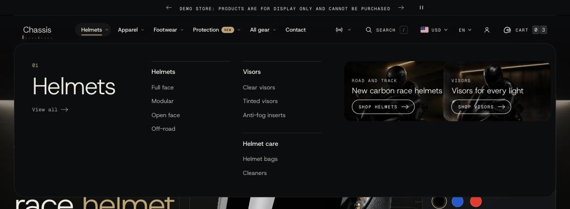
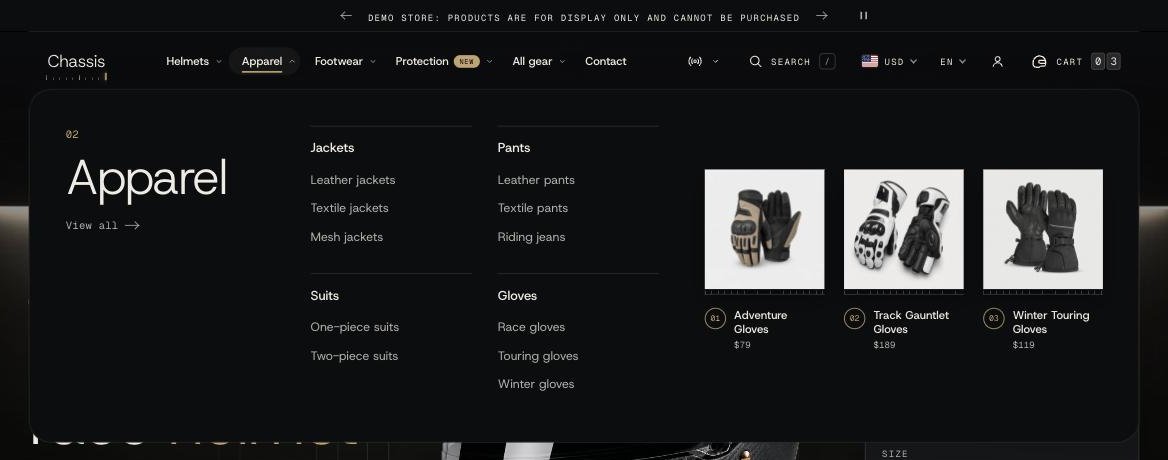
A top-level item that has links under it opens a menu panel: the item's name large on the left, its links in columns, and room on the right for products, collections or images.
How do I make a mega menu?#
Every item with a submenu already opens a full-width panel. To fill the right side of it:
- Products, automatically: turn on Header > Show products in the menu. Any item that links to a collection shows that collection's first products.
- Your own choice: add a Menu panel block (in the Header, click Add block > Menu panel). In Menu item, type the name of the top-level item exactly as it appears in the menu, for example
Helmets. Then pick what to show:- Products: a collection's first products (choose how many with Products).
- Collections: the collections you pick, as image tiles.
- Images: up to three banners, each with an image, subheading, heading, button label and link. Recommended image size 800 x 1000px.
Add one Menu panel block per menu item you want to fill. Mobile layout > Show in the phone menu and Image layout (carousel or stack) control the panel on phones.
How do I add a "New" or "Sale" tag to a menu item?#
Add a Menu label block. Type the menu item's name in Menu item, the tag text in Label (for example New), then choose a Style (pill, tag or dot) and a Color. Mobile layout > Show on phones keeps it in the phone menu.
What happens when the menu doesn't fit?#
On narrower screens the last items move into a More dropdown. If you'd rather switch to the menu button instead, change Header > Menu items that don't fit to Replace with the menu button.
Can the top-level item still be a link?#
Yes. With Enable top level links on, clicking the item goes to its page and the panel opens on hover. With it off, clicking opens the panel, and the page is one tap away under View all.
The phone menu#
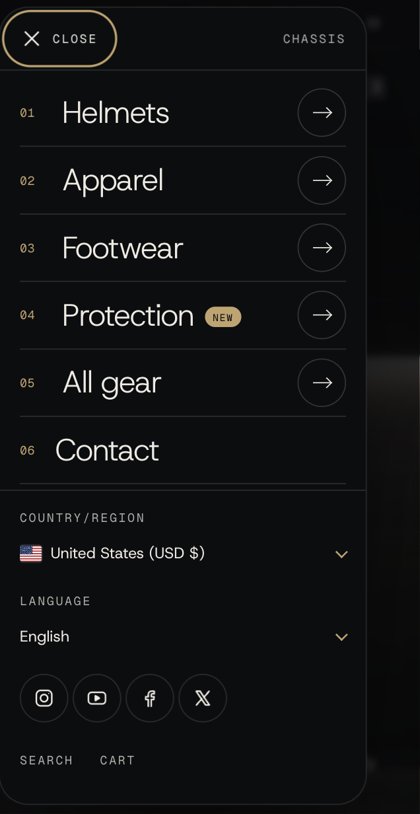
Items with a submenu show an arrow; tapping it slides the submenu in, with a back button. The country and language selectors, social icons and quick links to search and cart sit at the bottom. Mobile layout > Show logo in the menu replaces the store name at the top with your logo.
Transparent header#
Header > Transparent header lets the first section show through the header: Off, On the home page or On every page. It works when the first section on the page runs edge to edge:
- Product slideshow: always.
- Slideshow: with Width set to Full width.
- Hero banner: with Layout set to Content on the picture.
- Video: with Play as set to Background video, Content position set to On the video and Width set to Full width.
The header gets its background back as soon as the shopper scrolls. If it doesn't turn transparent, check that the banner is the very first section of the template, with nothing above it, and that it uses the settings above.
Sticky header#
Header > Sticky header: Always keeps it on screen, On scroll up hides it while reading down and brings it back when the shopper scrolls up, Off lets it scroll away. Show scroll progress draws a thin marker along the bottom edge as the page scrolls.
Header blocks#
The blocks inside the Header add the icons and extras. Drag them to change the order of the icons.
| Block | What it does |
|---|---|
| Search | The search icon or field. Menu shows quick links under the search field. Show keyboard shortcut lets shoppers press / to open search. On phones, search can be an icon, a bar under the header, or sit inside the menu. |
| Country and language | Currency and language selectors. Add countries in Settings > Markets and languages in Settings > Languages. Country display shows the flag, the flag and currency, or the country code and currency. |
| Account | The account icon, linking to Shopify's customer accounts. It always shows on phones, as Shopify requires. |
| Cart | The cart icon. Pick a helmet, kit bag, top case, box, shopping bag or cart, or upload your own square SVG or PNG (96 x 96px). Cart count shows the number of items as a rolling counter, a badge, or not at all. |
| Link | An extra text link in the bar, for example Track days or Contact. Show in the menu also adds it to the phone menu. |
| Menu panel | Fills a menu item's panel with products, collections or images (see How do I make a mega menu?). |
| Menu label | A small tag beside a menu item. |
Look and type#
- Colors: Color scheme for the bar and Menu color scheme for the panels and the search panel. Schemes are edited in Theme settings > Colors.
- Navigation: font (body, heading or monospace), text case, and the size and weight of the top level, the submenu headings and the submenu links. Phones have their own sizes under Mobile layout.
- Icons: Show text labels writes Menu, Search and Cart beside the icons on wide screens. Icon weight sets the line thickness.
- Social media: Show social media icons adds your accounts, set in Theme settings > Social media, as icons or a dropdown, before or after the icons.
Logo#
The logo is set once for the whole store in Theme settings > Logo and favicon, with separate widths for desktop and phones. Without a logo the store name is shown.
Announcement bar#
The bar above the header is its own section, Announcement bar, in the same Header group. Add one Announcement block per message; with more than one they turn over on a timer, and shoppers can pause them. On phones a message wraps to two lines at most, so keep it short.