Product page#
Open a product page in the theme editor: Online Store > Themes > Customize, then pick Products > Default product from the page menu at the top. Every product uses this template unless you assign it another one.
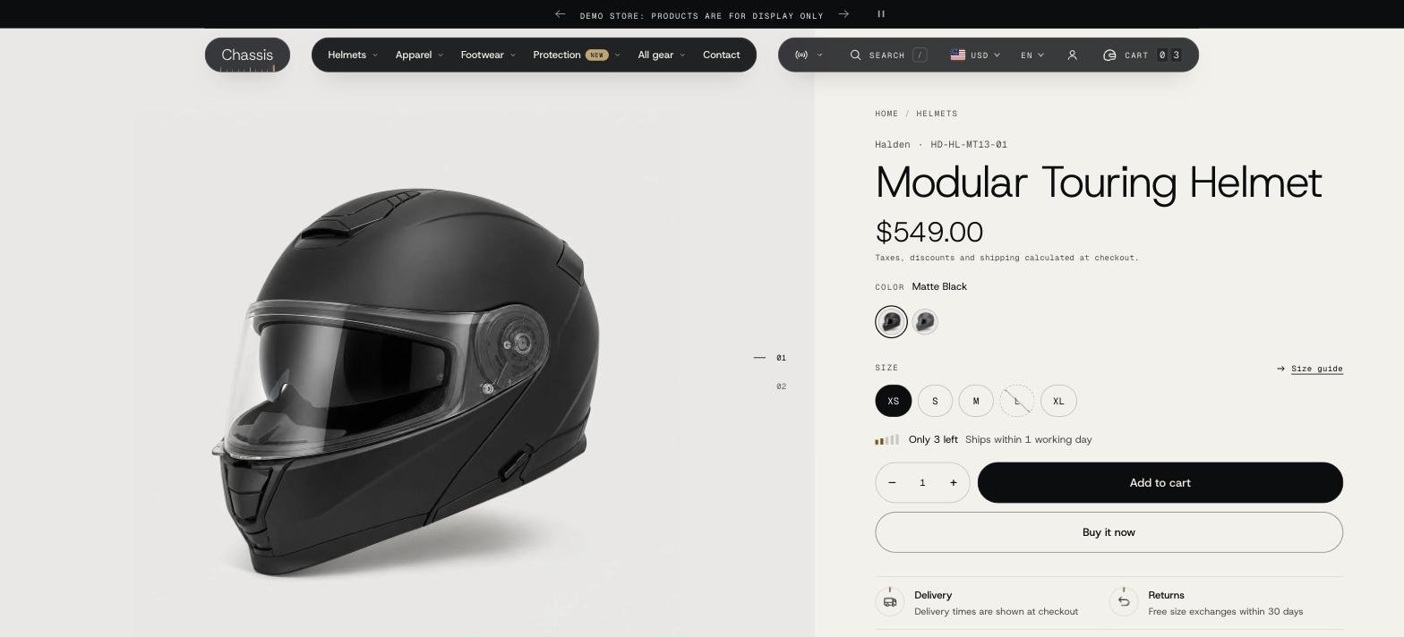
The Product information section#
This is the gallery and the buy column. Its blocks build the buy column from top to bottom, so drag them into the order you want.
Gallery#
- Layout: Slideshow (one photo at a time), Grid (every photo down the page), Horizontal scroll (side by side) or Turntable (drag or turn the dial to spin through the photos, good for helmets and boots shot from every angle).
- Thumbnails: numbers, thumbnails below, or thumbnails beside the photo.
- Image fit and Image ratio: show the whole photo or fill the frame, and the shape of the frame.
- Zoom: open the photo full screen, magnify it on hover, or off.
- Stage color: Match each photo reads each photo's background and gives the stage the same color, so studio photos shot on one plain color fill the stage edge to edge with no visible box (other photos use the Media color scheme). Media color scheme always uses that scheme. Same as the page drops the separate stage color, so the gallery sits on the page's own background.
- Video fit: Show whole video keeps each video's own shape; Fill the frame crops it to fill the gallery. Uploaded videos play with the theme's own controls; YouTube and Vimeo use their own players.
On phones, Mobile layout > Media shows a carousel, a carousel with the next photo peeking in, the turntable, or all photos stacked, and Progress shows numbers, a bar or thumbnails.
How do I show only the photos of the selected color?#
- In the Shopify admin, open the product and give each color variant its own variant image (the first photo of that color).
- Order the product's photos so each color's photos follow its variant image: black photos, then red photos, and so on.
- In the theme editor, set Product information > Variant images to Only the selected color.
When a shopper picks a color, the gallery shows that color's photos only. Photos before the first variant image, videos and 3D models always show.
Sticky add to cart#
The bar that slides up from the bottom of the screen once the buy buttons scroll out of view is its own section, Sticky add to cart, on the product template. Remove it to turn the bar off, or change it:
- Show on desktop, Style (a floating capsule or a full-width bar) and Color scheme.
- Content: the product image, the selected options, a variant picker (each option as a dropdown that stays in step with the product page), a quantity selector and the price.
- Mobile layout: show it on phones, and whether phones get the variant picker (on its own row) and the image.
Its button adds to cart through the product's own buy form, so purchase options and gift card details go with it. It needs a Buy buttons block in Product information.
Blocks in the buy column#
| Block | What it does |
|---|---|
| Breadcrumbs | The path back to the collection. |
| Title | The product name, with the vendor and SKU if you turn them on. |
| Product rating | Stars from your reviews app (see Reviews). Clicking it scrolls to the reviews on the page. |
| Price | Sale price, compare-at price, a sale badge (amount or percent saved), unit price and the tax note. |
| Short description | A few lines above the options. Leave it empty to use the start of the description, or connect a product metafield. |
| Variant picker | The options (color, size). How each option looks (swatches, buttons or a dropdown) is set for the whole store in Theme settings > Variant picker. Values wraps them or keeps them on one sliding line. |
| Stock | Where the chosen variant stands: in stock, low stock, available to order or sold out, each with its own text (write [count] for the number left), a dispatch note for items on the shelf and items to order, the number left when low or always, and a five-tick gauge. |
| Buy buttons | Add to cart, quantity, accelerated checkout buttons (Shop Pay, PayPal, Apple Pay), installments and payment icons. |
| Pickup availability | Shows local pickup when a location offers it. |
| Key facts | Up to four short facts with icons, such as delivery, returns or warranty. |
| Collapsible row | A row that opens, with text and, optionally, a page's content. |
| Description | The full product description. |
| Download | A file for the product: a manual, size and care sheet or certificate, as a card, a button or a text link (see below). |
| Text, Share, Custom Liquid | Extra text, share links and your own code. |
| Share (details) | A Share button that opens a small menu: Copy link, Facebook, X, Pinterest, WhatsApp and Email, plus the phone's own share sheet where there is one. Switch each network on or off in the block. The link includes the size or color the shopper picked. |
Apps that offer product page blocks appear under Add block > Apps.
Size guide#
The size guide opens in a sheet beside the size option, with a link under the option.
- Create the chart as a page: Online Store > Pages > Add page, with a table in the content.
- In the Variant picker block, under Size guide, pick that page in Page. Option says which option it belongs to (leave empty to use the last option).
Different charts for helmets, jackets and boots#
Each product can show its own chart, without a separate template:
- By collection: in Settings > Custom data > Collections, add a definition with the namespace and key
custom.size_chart, type Page (one page). Open each collection and pick its chart. Every product in that collection uses it. - By product: add a product metafield of type Page, then in the Variant picker block click the Connect dynamic source icon beside Page and choose it.
When a metafield is connected, products with an empty metafield fall back to their collection's chart: the first of the product's collections that has one. If you pick a fixed page in Page instead, every product shows that page.
Download block#
Add a Download block to offer a file such as a manual or a size and care sheet.
- Upload the file in Content > Files and copy its link.
- Paste the link in File, write a Label (for example Care and fit guide) and Details (for example PDF, 2 MB).
- Choose a Style: Card, Button (primary, secondary or outline) or Text link, and a Color scheme if it should stand apart from the section.
For a different file per product, connect a product metafield of type File or URL to File. The block hides itself on products that have none.
Product details section#
Product details shows specifications, protection ratings, materials, care steps and downloads as tabs. Each block's text is one item per line:
- Specifications:
Label: value, for exampleShell: Carbon fiber. - Protection ratings:
Area | Level | Standard, for exampleShoulders | Level 2 | EN 1621-1. - Materials:
Part: material. - Care: one step per line, numbered in order.
To fill them per product, create a product metafield of type Multi-line text (for example custom.specs) and connect it with the dynamic source icon. A block with nothing in it is left out, together with its tab.
Different templates for different gear#
Helmets, jackets and boots tell different stories. Create a template per kind of gear:
- In the theme editor, open the page menu at the top, choose Products > Create template, name it (for example helmet) and base it on Default product.
- Change its gallery layout and add sections such as Image with text (a fit guide), Multicolumn (facts true for every helmet), Image comparison or Product hotspots.
- In the Shopify admin, open each helmet and choose the template under Theme template. To change many products at once, use Bulk edit.
Below the product#
Add any section under Product information. These work especially well on a product page:
- Product recommendations: related products from Shopify's recommendations.
- Recently viewed: the products this shopper looked at in this browser, newest first. It stays hidden until they've viewed one.
- Apps: for a reviews app widget (see Reviews).
- Image comparison: drag between two photos, for example a jacket outside and inside.
- Product hotspots: a product photo with points that explain each feature.