Footer#
Click Footer in the left sidebar of the theme editor.
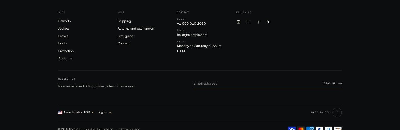
Settings#
- Large brand display: Store name or Logo sets it large across the top of the footer. Finish line sets the store name huge at the foot of the page, under a checkered strip; turn on Fade store name to let it fade out toward the bottom. None leaves it out. Subheading adds a short line with it.
- Bottom bar: country and language selectors, Follow on Shop, social icons, policy links, payment icons, Powered by Shopify and a Back to top button.
- Mobile layout: Show large brand display, one or two Columns, Use collapsible menus so each menu opens with a tap, and Show policies in one row (shoppers swipe sideways when they don't fit).
Blocks#
| Block | What it does |
|---|---|
| Menu | A heading and a menu from Content > Menus. |
| Text | A heading and text, for example about your shop or workshop. |
| Image | An image with an optional heading, link and caption, such as your showroom. Image shape (Original, Landscape, Square) and Maximum width; it never grows wider than its column. On phones it fills the width by default (Mobile layout > Fill the width); turn that off to set an Image width. |
| Contact | Phone, email, opening hours and address. |
| Map | Your shop on a Google map, with the address and a Get directions link. Set the Address, Zoom, Map style (Muted or Color) and the Button label. It needs an address to show in your store. |
| Social media | Your accounts from Theme settings > Social media. |
| Email signup | An email signup form. Signups go to Customers with email marketing accepted. Position: Own row below the columns, or In the columns. |
| Custom Liquid | Your own Liquid, HTML or app snippet. |
The footer makes as many columns as your blocks need, so none is left empty. Each block has Show on phones and a Column width.
Where do the policy links come from?#
From Settings > Policies. Fill in the refund, privacy, terms of service and shipping policies there, and turn on Show policy links.