
Collection page
Switch the editor to a Collection page. The Collection section lists the products; the blocks inside it add the title, description, sorting and any banners you want among the products. The collection’s own picture and heading at the top come from the Collection banner section above it.
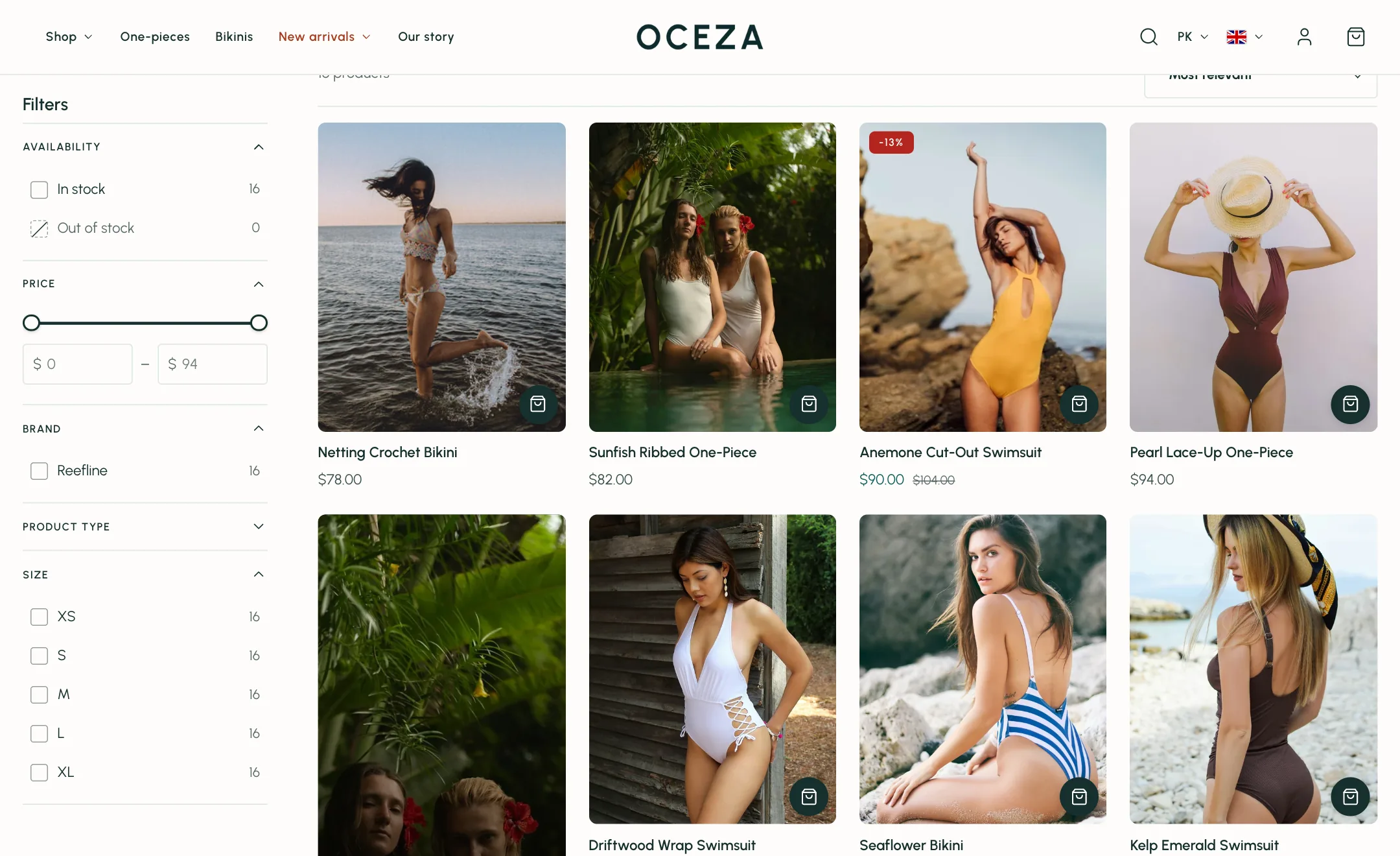
Filters
Section titled “Filters”Show filters turns them on. The filters themselves are set up in Shopify Search & Discovery app; the theme shows what you set there.
Filter layout puts them in a Sidebar beside the products (left or right), in a Horizontal bar above them, or in a Drawer that opens over the page. Keep filters sticky makes the sidebar or bar follow the page as it scrolls.
Open filter groups decides how many groups start open; Filter groups to open names groups that always start open. Long groups show Values shown before show more values and fold the rest. Show result counts puts the number of matches beside each value. Colour filters show as swatches, sized under Swatch size.
Applied filters appear as chips above the products so shoppers can remove one at a time.
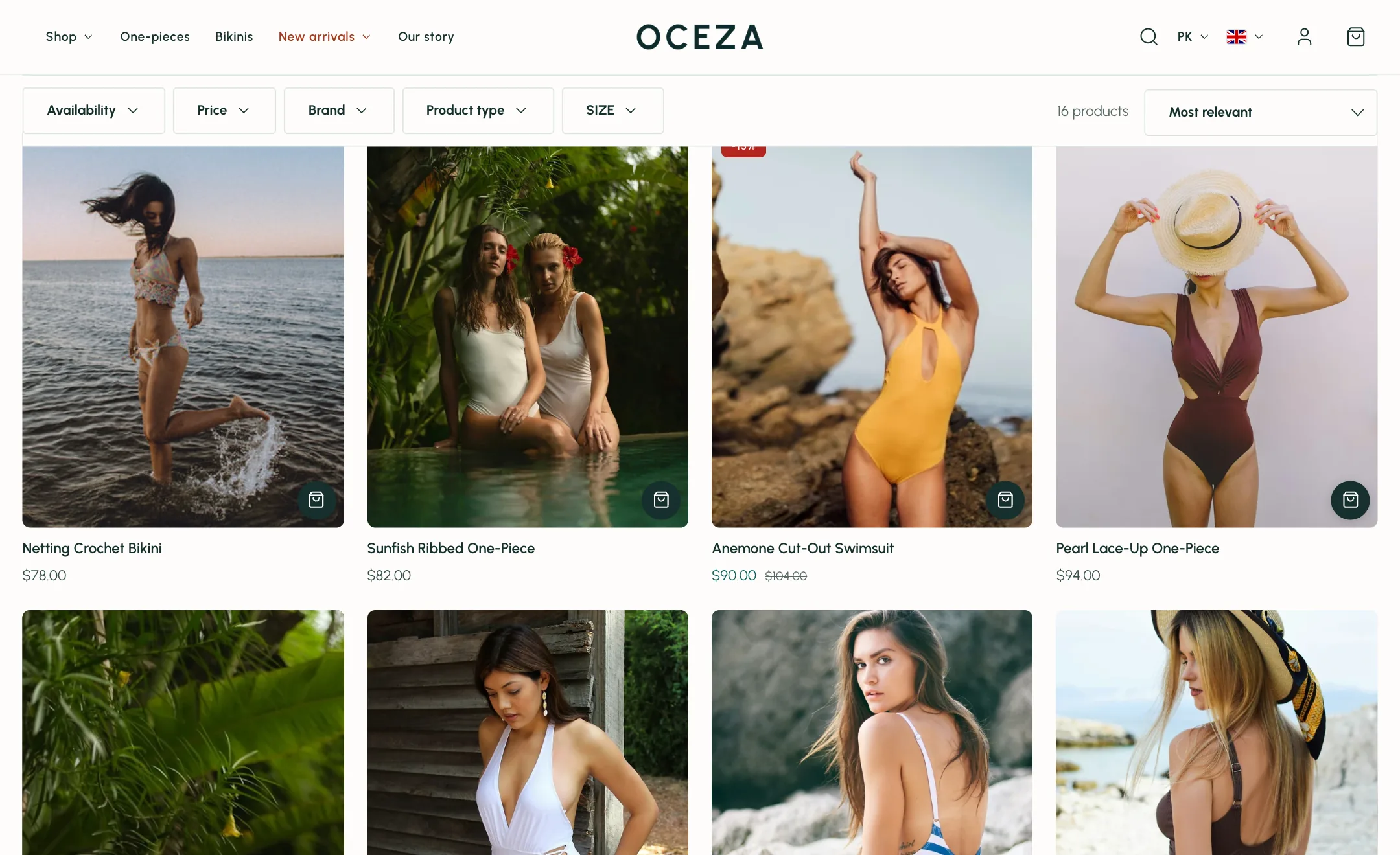
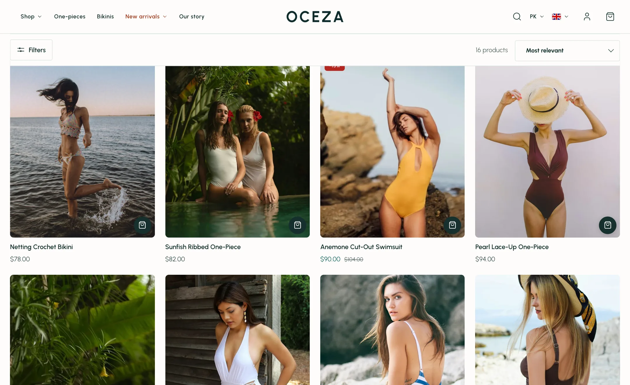
Sorting and layout
Section titled “Sorting and layout”Show sorting adds the sort menu. Under Layout, Products per row is two to five, Products per page sets the count, and Pagination decides how the next products arrive: Page numbers gives each page its own address, which suits large catalogues and search engines; Show more adds the next page under the last on a button press; Infinite scroll adds it as the shopper nears the bottom, with the button as a fallback. Show more and infinite scroll keep the shopper’s place when they come back from a product. Width is boxed or full.
Blocks
Section titled “Blocks”- Title sets the heading size and whether the product count shows after it.
- Description shows the collection’s text, capped at a width.
- Text is a note of your own.
- Sorting options is where the sort menu sits.
- Products is the grid itself.
- Image banner drops a picture or video among the products, after the number you set. It can take one or two products’ width and one or two rows’ height, with the same words, overlay and button as any banner.
- Spacing adds a gap where you need one. Custom Liquid is for code from a developer.
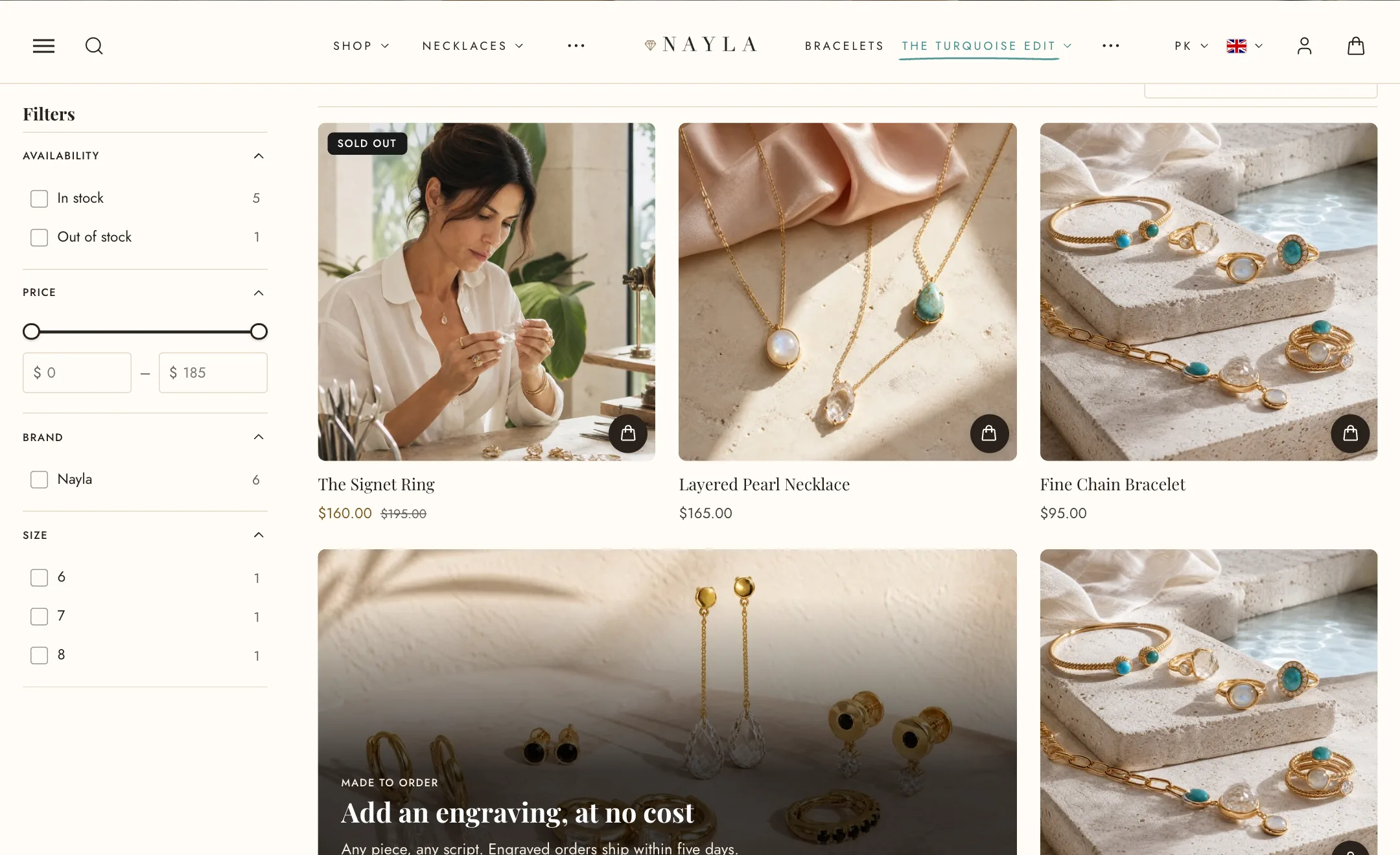
On mobile
Section titled “On mobile”Products per row under Mobile layout is one or two. Filters open in a drawer on phones whatever the desktop layout.
Product cards
Section titled “Product cards”Product cards in collection grids use your store-wide card settings. To adjust the image shape, displayed text, swatches, labels, or add-to-cart style, go to Theme settings → Product cards. Changes made there apply to product cards throughout your store.