
Collection list
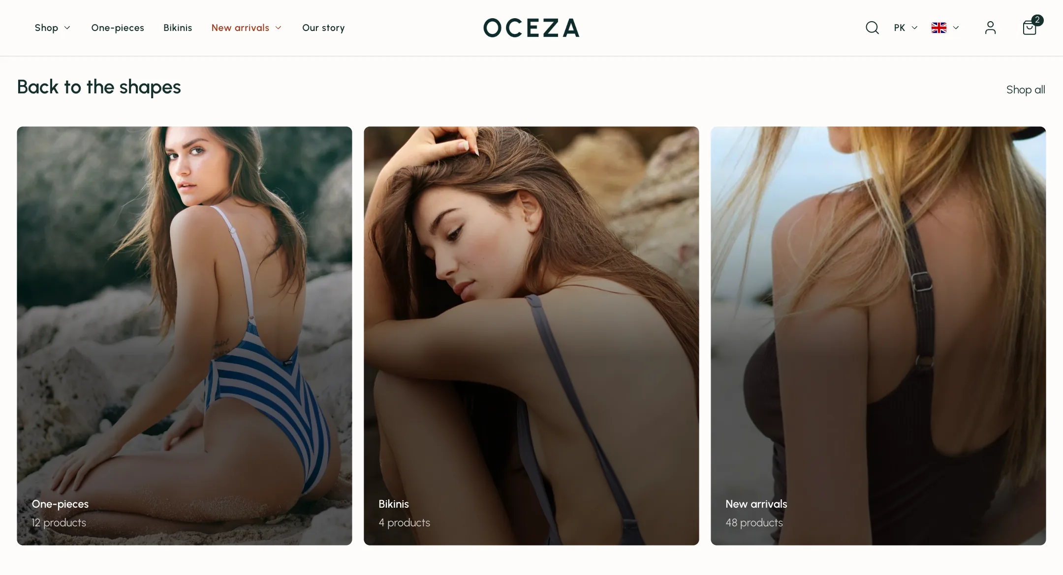
Shop by category: each collection as a card with its picture and name. Add a Collection block for each one.
The cards
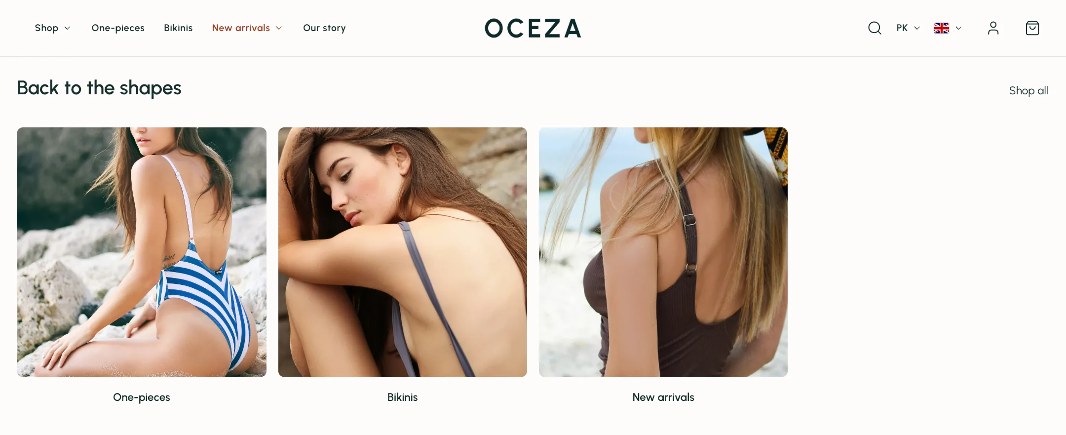
Section titled “The cards”Each Collection block picks a collection. Leave the rest empty and the card uses the collection’s own picture and name; or give it a different Image, a Label to replace the title, a Line under the name, and a Button label to aim at.
Under Cards: Image ratio from portrait to circle or a custom ratio; Image fit to crop to fill or show all of a logo; room around the picture; name size and alignment; button style; a Card style (minimal, border, shadow, background) with its colour. Collection name goes under the picture, on it (at any of nine positions, with an overlay to keep it readable), or away. Show product count and Zoom image on hover are switches. Title lines and Description lines shorten long text.
Layout
Section titled “Layout”Under Heading: heading, subtext, alignment and a View all link. Under Layout: Carousel or Grid (a carousel becomes a grid when everything fits), Collections per row (one gives full-width cards), space between, and optional dividers. Under Carousel: pagination style and where the arrows sit.
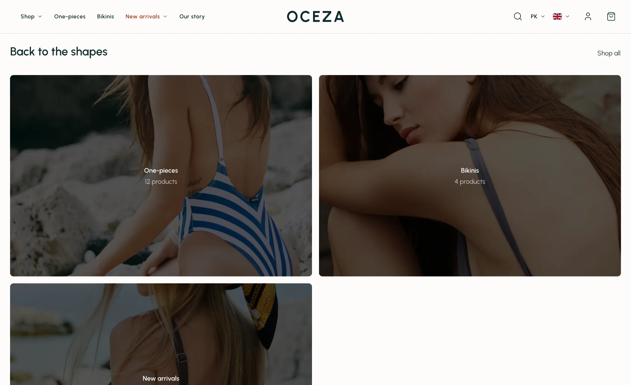
On mobile
Section titled “On mobile”Swipe sideways or a grid, one or two per row, with its own pagination.