
Flexible grid
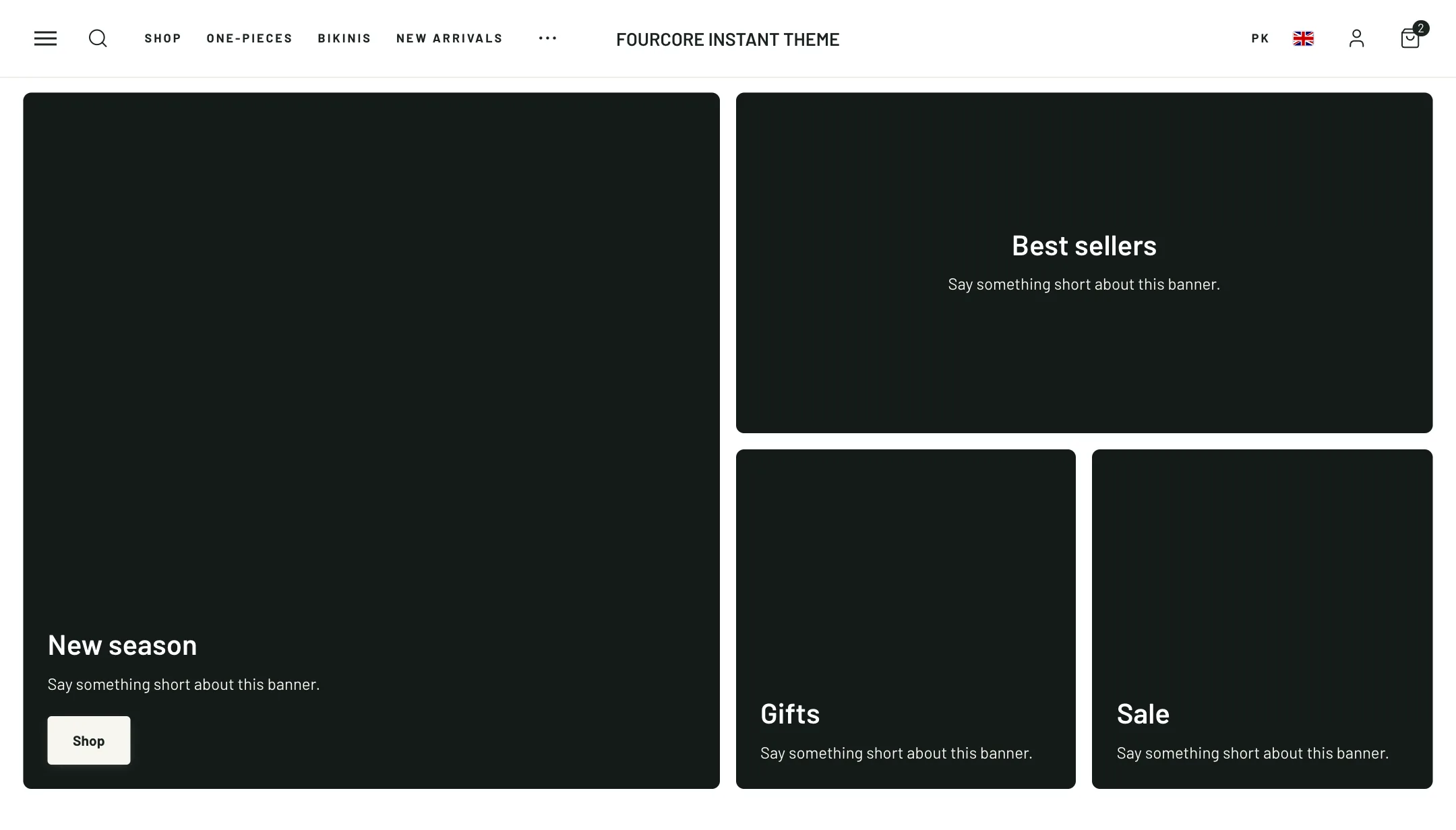
Where Banner columns gives every tile the same size, the flexible grid lets each tile take its own: one large picture beside four small ones, a wide strip over two squares, any arrangement the grid allows.
The grid
Section titled “The grid”Under Layout, Grid columns is four or six; each tile spans some of these. Row height adapts to each picture or is short, medium or tall. Space between banners, Corner radius, Zoom image on hover and Width finish the frame.
Each tile
Section titled “Each tile”Each tile is the same Banner block the banner columns use: a picture or video, overlay, colours, words placed over or below the picture, a button, a whole-tile link, and an animated badge. Under its Grid placement, Columns to span and Rows to span set its size in the grid.
On mobile
Section titled “On mobile”Layout is one per row, two per row, or Keep the grid, which halves the columns and honours each tile’s span. Phones have their own row height and spacing, and a tile can claim the whole row with Full width on mobile.