
Product cards
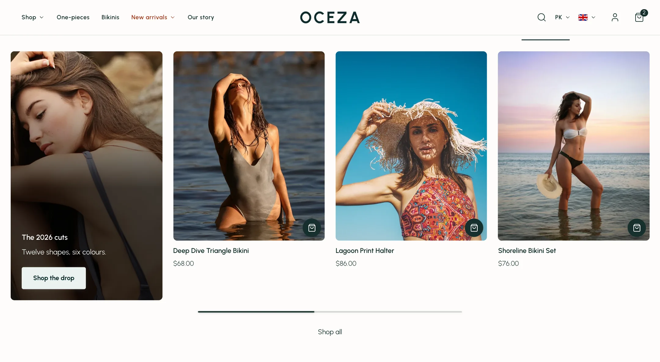
A product card is the small tile a product appears as on collection pages, in featured collections, in sliders and in search. Instant sets them once, under Theme settings → Product cards, and every card follows. Sections that show products only decide how many and in what layout.
Card and picture
Section titled “Card and picture”Card style is minimal, a border, a shadow, a shadow on hover, or a background colour. Text alignment is left or centred.
Image behavior decides what happens on hover: show the second picture, the last one, an image slider, or nothing. Image ratio crops every picture to one shape, or adapts to the shortest or tallest picture in the row. Image fit crops to fill or shows the whole picture. Blend images into the background hides the white ground of studio photos. Fade sold-out products dims them. Show product labels puts the sale, sold out and new labels on the picture; set the labels up under Theme settings → Product labels.
The title and price have their own font, weight and sizes for large screens and phones. Under Content: vendor, a Title line limit so long names end with three dots, a Short description taken from the product’s subtitle or the first words of its description, a rating for stores using review apps, a stock line (Low stock only, In stock, or with the quantity), and a delivery line worded under Theme settings → Shipping and delivery.
Under Prices: a From price when a product’s variants differ, and a tax note.
Colour swatches
Section titled “Colour swatches”Show color swatches puts the product’s colours on the card, up to Maximum swatches, always or on hover. Clicking a swatch either swaps the card’s picture to that colour and links the card to it, or opens the product page. Swatch pictures and colours are set under Theme settings → Swatches.
Add to cart
Section titled “Add to cart”Layout is the big choice.
- Basic shows no button. The card is a link to the product.
- Quick shop puts a small round button on the picture. One tap adds a product with no options; for a product with sizes or colours it opens a quick shop panel so the shopper picks first. Icon on products without options and Icon on products with options choose the icons.
- Add to cart puts a full button on the card, with optional variant and quantity choosers, shown always or on hover, in the position and style you pick.
On mobile, Show add to cart on mobile is off by default; with two cards per row the button crowds the card.