
Product page
Open the theme editor and switch to a Product page. The main Product section places the media gallery beside a details column. Configure the gallery in the section settings, then add, remove, or reorder blocks to build the product details.
Photos
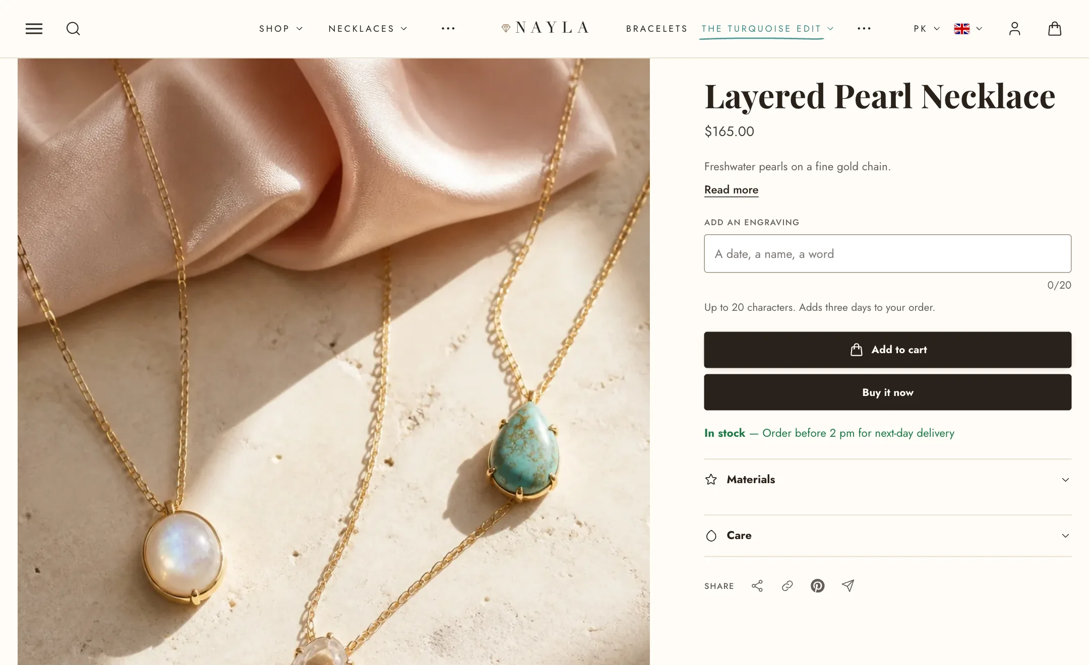
Section titled “Photos”Media position puts the photos left or right, and Media width sets how much of the page they take.
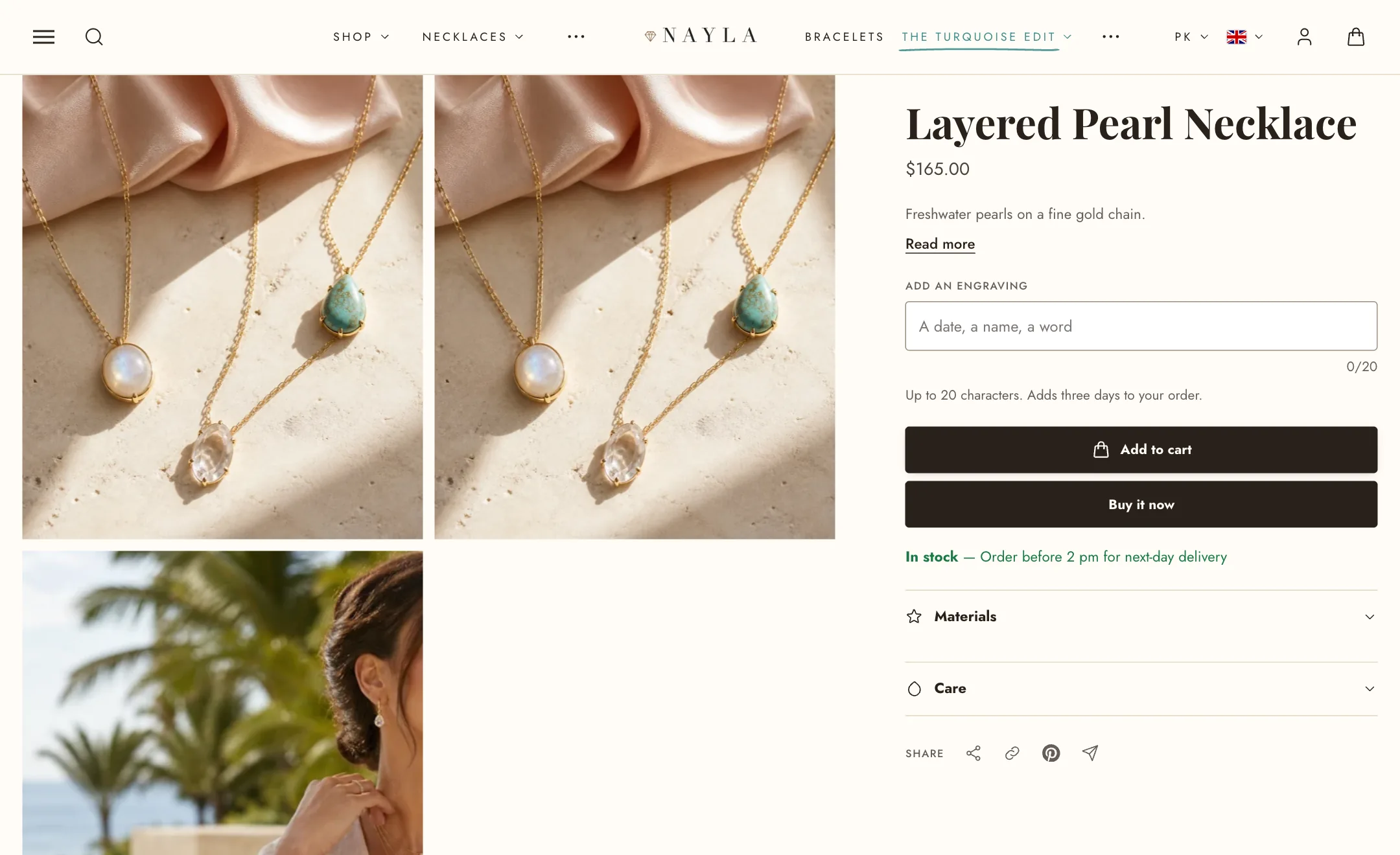
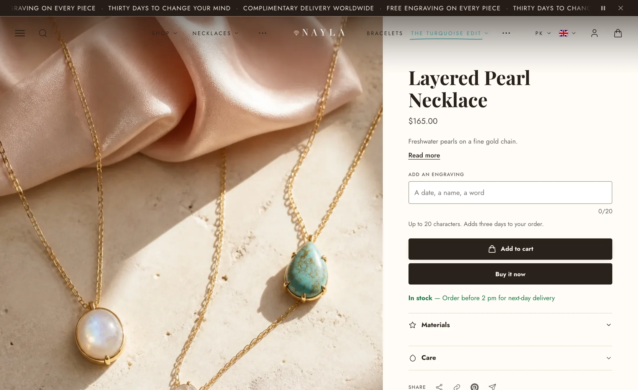
Photo layout has six arrangements. Carousel is one large photo the shopper moves through. Stacked shows every photo in a column. Two columns and Collage lay them out in a grid. Split screen runs the photos to the screen edge with the details beside them. Grid mix alternates sizes. Phones always swipe, whatever you choose.
Image ratio crops every image to one shape, while Adapt to image preserves each image’s original proportions. Image fit either fills the frame or shows the complete image with space around it.
Thumbnails can appear below, over, or beside the main images, or be hidden. When placed beside the gallery, they stay visible while the page scrolls and move directly to the selected image when tapped.
Other choices worth knowing:
- On arrival show decides whether a link to a specific variant opens on that variant’s photo or on the first photo.
- Keep the shorter column in view holds whichever side ends first on screen while the other scrolls. Turn it off for a plain page.
- Open photos full screen lets a tap open a photo in a full-screen viewer. Magnify on hover shows a close-up that follows the mouse on a computer.
- Show product labels on the photos puts the same sale, sold out and new labels that cards show onto the main photo.
- Collapse gallery after hides photos beyond a number behind a Show all photos button, for products with many.
- Loop videos and Start videos automatically apply to videos among the photos. Autoplay is muted and the controls stay available.
The details column
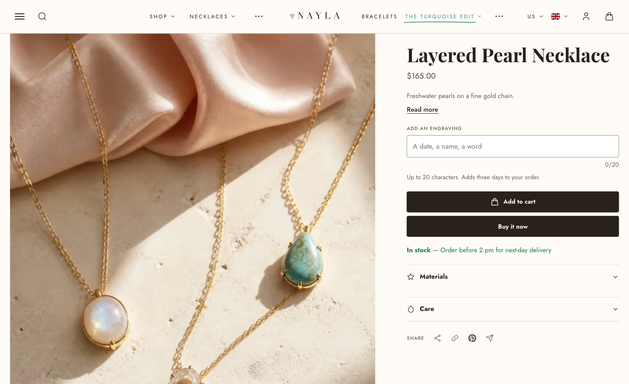
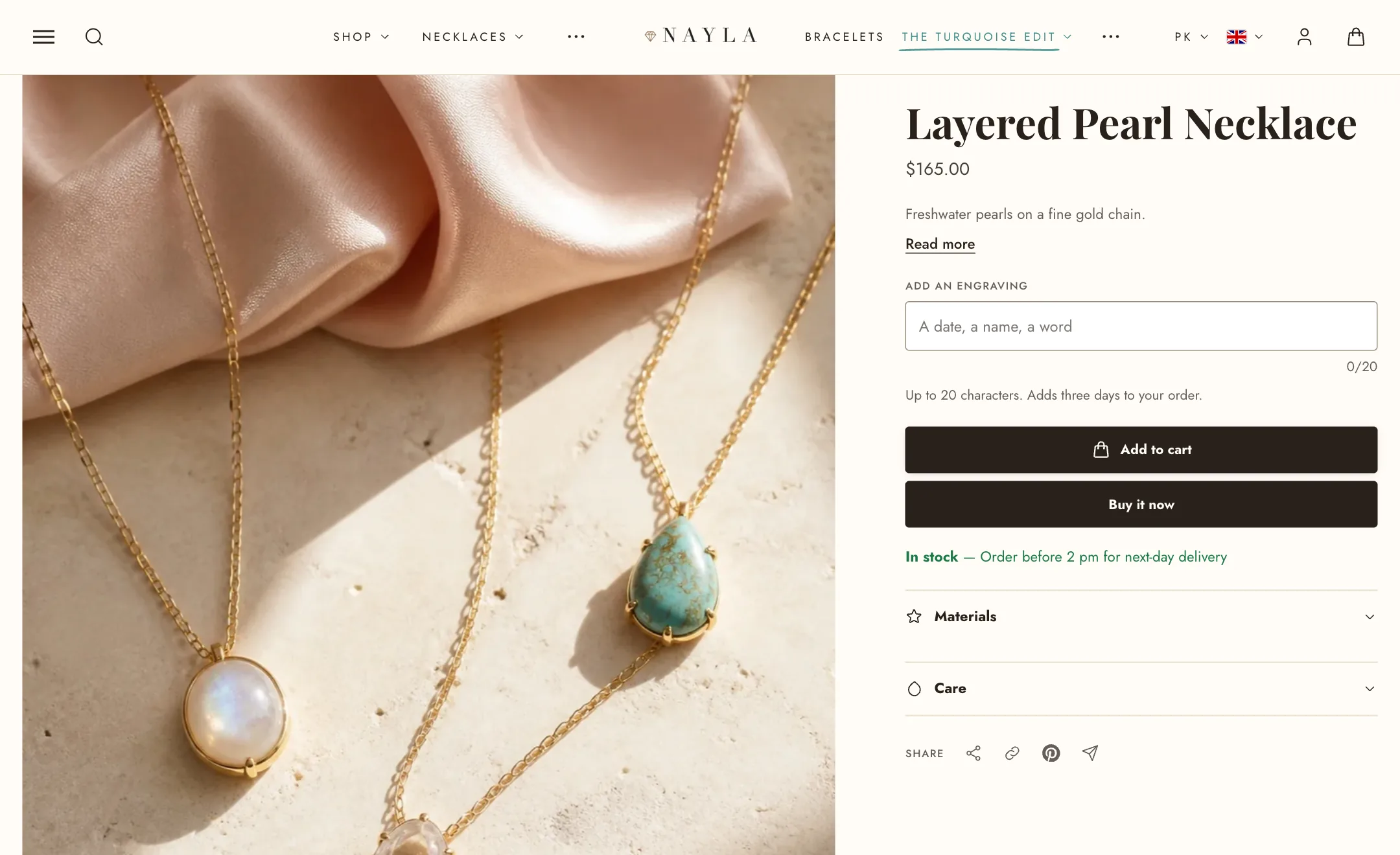
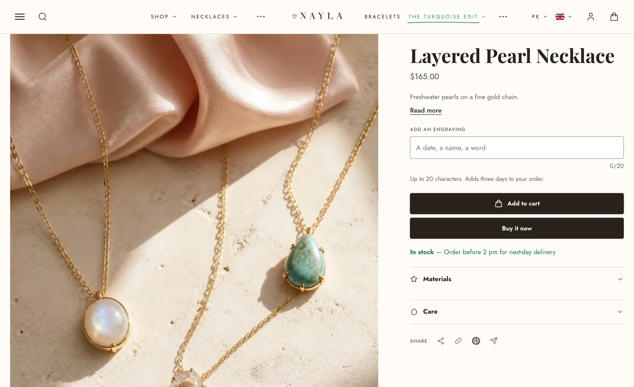
Section titled “The details column”Everything in the details column is a block. The usual order is title, price, variant picker, buy buttons, then whatever helps a shopper decide. Each block has a few settings of its own.
- Title, Price (with a saving line and tax note), Vendor, Rating, Product codes (SKU and barcode), Product labels.
- Custom Liquid: a place for an app’s snippet or your own code, anywhere in the column, and app blocks from the apps you install.
- Variant picker: buttons or a menu, colour swatches, and what to do with choices that are sold out.
- Buy buttons: quantity selector, dynamic checkout buttons, and the recipient form for gift cards.
- Inventory and delivery: stock status and the delivery time from Theme settings → Shipping and delivery.
- Quantity rules, Volume pricing and Purchase options for stores using those Shopify features.
- Pickup availability shows which of your locations have the item.
- Short description: the product’s text, or your own, with a Read more link.
- Custom field asks the shopper for something, such as an engraving, with a character limit and choices.
- Fit rating: a small scale, such as “Runs small” to “Runs large”.
- Frequently paired: add-ons the shopper can tick to add with the product.
- Disclosures: a heading with folding rows for care, materials or sizing.
- Share: copy link, Facebook, X, Pinterest, WhatsApp, email.
- Featured review: one quote with stars and a customer photo, and a link that scrolls to your reviews. Scroll to on it, and on the Rating block, takes the reviews tab by default or your review app’s own id.
- The general blocks too: heading, text, buttons, countdown, collapsible row, icon columns, trust badge, scrolling text, payment banner, popup, and blocks from apps.
Sticky add to cart
Section titled “Sticky add to cart”The Sticky add to cart section, listed in the editor’s left column on product pages, pins a compact bar to the screen after the shopper scrolls past the main buy buttons. It uses the product’s existing form, so the selected selling plan, custom fields, and add-ons are included with the order.
Show on limits it to phones or computers, Position puts it at the bottom or top, and Style is Standard or Minimal with only the price and button. Tick what the bar shows: the product photo, the options picker (with List sold-out options keeping unavailable ones visible but disabled), quantity, the tax note and the accelerated checkout button. Hide while editing the theme keeps it out of your way in the editor.
Product details
Section titled “Product details”The Product details section sits under the product and holds the long-form content: the description, a specifications table, a pros and cons list, free content rows, and app blocks. Show as lays them out as Tabs or stacked Rows, and Show as on mobile can differ, since a row of tabs is awkward on a phone. Open the first row starts with the first one expanded. Name for app tabs labels a tab for an app block that has no heading of its own.
Quick shop
Section titled “Quick shop”Enable Quick shop under Theme settings → Product cards. Products with options then open in a panel instead of being added immediately.
Use the Quick shop section in the editor’s overlays group to choose a Popup or Drawer and select the blocks it displays, including title, price, rating, vendor, product codes, inventory, variant picker, buy buttons, description, and app blocks. Under Photos, set the carousel’s image ratio and fit, and choose whether to show product labels.
Under Mobile layout, choose a bottom sheet, side drawer, or full-screen layout. You can also set full-width images, thumbnails or dots, next-image preview, and a separate mobile image ratio. Quick shop uses the product’s existing form, so selling plans and add-ons continue to work. It displays one product at a time and does not include the full gallery zoom or product-detail tabs.
On mobile
Section titled “On mobile”Under Mobile layout: photos can run edge to edge, show a peek of the next photo so shoppers know there are more, take their own shape, and use thumbnails or dots. Let the header overlap on mobile too decides whether a transparent header floats over the first photo on phones.
Product cards
Section titled “Product cards”Product cards shown on collection pages and in product sliders use your global card settings. To adjust them, go to Theme settings → Product cards. Changes made there apply to product cards throughout your store.