
Hotspots
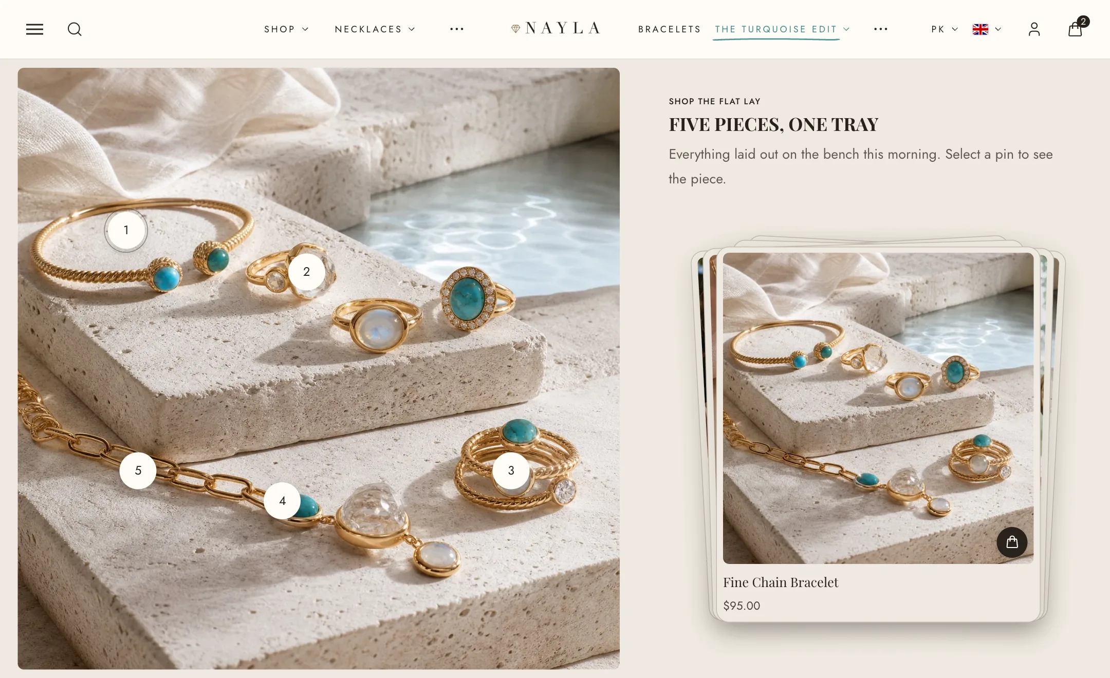
Three sections share one idea: a photo with small pins on it. Tap a pin and something opens. Which section you choose depends on what should open.
Placing a pin
Section titled “Placing a pin”In every one of the three, each pin is a block. Under Desktop position and Mobile position, Horizontal and Vertical are percentages across and down the picture, so a pin stays on the same spot whatever the screen. The picture itself has a Desktop height (from 32:9 to adapt to the picture or a custom height) and, under Mobile layout, its own picture and height for phones.
Product hotspots
Section titled “Product hotspots”Each pin is a Product. The products appear as cards beside the picture, and tapping a pin highlights its card. Under Add to cart, choose Basic, Quick shop or a full Add to cart button, with variant and quantity choosers. Cards follow Theme settings → Product cards. Pin color scheme colours the pins.
Bundle hotspots
Section titled “Bundle hotspots”The same, with one difference: the cards let the shopper pick an option for each product, and one Add all to cart button adds the whole look at once. Set its label and width under Add to cart, and how many products sit per row beside the picture.
Banner hotspots
Section titled “Banner hotspots”For explaining rather than selling. Each pin is a Hotspot with a heading, text, an icon or picture, and a link. Under Hotspots, pins show a plus sign or a number, can pulse (Animate pins), and the details card has its own colour scheme. The heading and text for the section can sit above, beside or over the picture.