
Footer
The footer appears on every page. Select it at the bottom of the editor’s left column. Its columns are blocks, so you decide what sits where; the bottom bar is a set of switches.
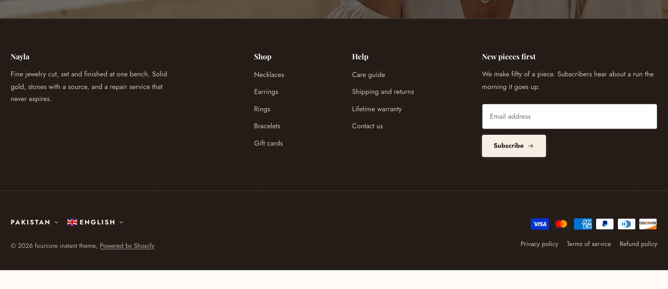
The footer
Section titled “The footer”Color scheme paints it; a dark scheme is the usual choice. Width is boxed or full. Columns per row is a fixed count, or Fit automatically, which lets each column be as wide as its content, so a short link list does not take a quarter of the page.
Columns
Section titled “Columns”Each column is a block, and each has a Column width of one column, two columns, or the full row.
- Links is a heading and a menu from Navigation in your admin. Dropdown items are not shown. Link layout on mobile collapses the list behind its heading, or shows it at half or full width.
- Newsletter is a heading, a line of text and the sign-up form. Subscribers land in your customer list marked as accepting marketing. Use compact layout joins an icon button to the email field. Social links can sit under it.
- Brand and social media is your story in a few lines, with a logo or picture above or below, an optional WhatsApp contact link, your social links and a Follow on Shop button.
- Custom liquid is for code from a developer.
Social links themselves are set once under Theme settings → Social media, and every block that shows them reads from there.
Bottom bar
Section titled “Bottom bar”Show payment icons lists the payment methods your checkout accepts. Show country/region selector and Show language selector appear when your store has more than one of each, with styles from a bare country code to a flag with the name and currency. Show Powered by Shopify and Show Follow on Shop button are switches. A Lower footer menu block adds a small menu to the bar, for policies and legal pages.