
Storytelling sections
Use these sections to explain your brand and products between merchandising sections. Choose from an image with text, a row of content columns, or a guided list of product features. They share controls for the heading, bold-word style, supporting text, alignment, Color scheme, Width, and section spacing.
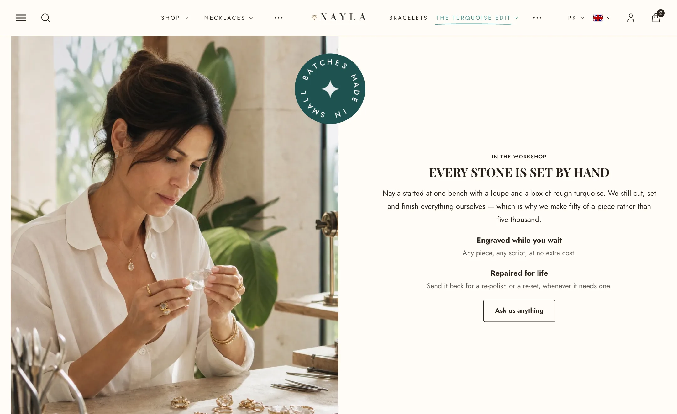
Image with text
Section titled “Image with text”A picture on one side, words on the other. Under Image: the picture, its side, its column width, its ratio (square, portrait, landscape) and hover zoom. The words are blocks: eyebrow, heading, text, buttons, and anything else the theme offers.
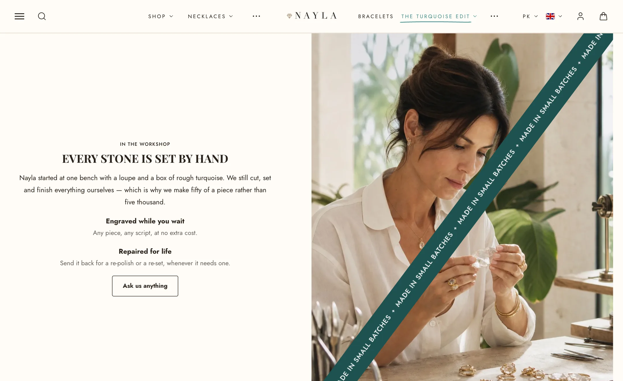
Animated badge pins a turning ring of words, a diagonal ribbon or an arc of words over the picture, with an icon in the middle, in the corner you choose, at the speed and direction you set. It has its own size and side on phones.
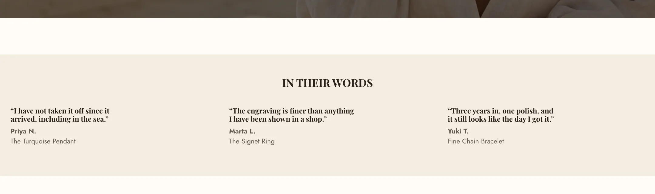
Multicolumn
Section titled “Multicolumn”A row of Columns, each a block with a picture or icon, a video, a heading, text and a link. Under Images: the shape (match the picture, square, portrait, landscape, circle), the picture’s width (use a small width for icons), hover zoom, and whether the words sit below the picture or over it with an overlay. Play videos automatically starts column videos silently when they come into view.
On mobile the columns swipe sideways with pagination, or stack in one or two columns.
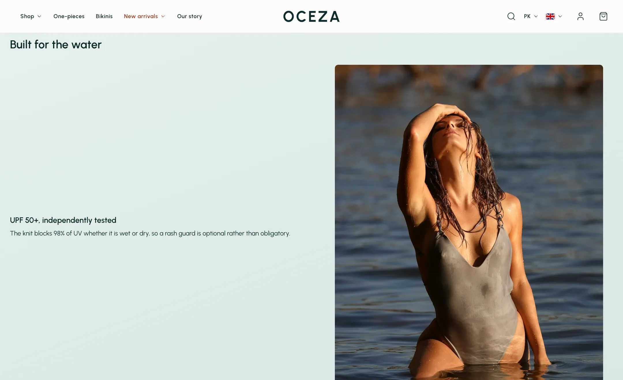
Key features
Section titled “Key features”A list of features beside one picture that changes as the shopper scrolls. Each Feature block has a picture or video, an icon, a heading and text, its own Color scheme the whole section eases into while that feature is in view, and an optional Scale: a row of segments rated between two words, such as “Tight fit” and “Loose fit”, with the highlighted segment you choose.
Under Layout: the picture’s side, ratio and size, and whether the scale sits above or below the text.
Before and after
Section titled “Before and after”Two pictures the shopper compares by dragging a handle. Under Images: the two pictures, a Divider left-and-right or top-and-bottom, the Starting position of the handle, and the two labels. Under Layout: the picture’s side, column width, height, and where the words sit beside it.
Text mask
Section titled “Text mask”A large heading with a photograph showing through the letters. Write the Heading and set its size as a share of the section’s width. Under Photo: a wide picture, at least 2400 pixels, an overlay inside the letters, and Parallax so the picture drifts as the page scrolls. Background adds a block of colour behind one side.