
Banner columns
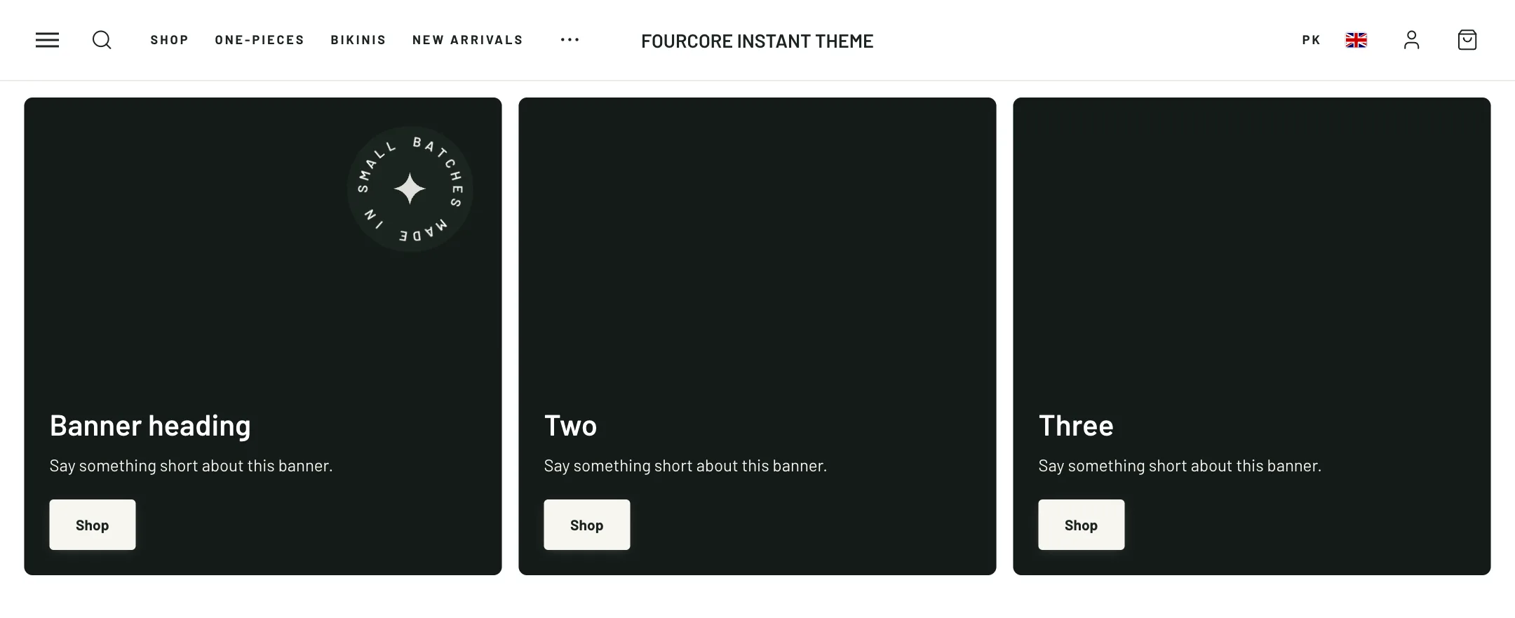
Banner columns is a set of banner tiles in a grid: three collections in a row, a picture that spans two columns beside two smaller ones, or a wall of six. Each tile is a block.

The grid
Section titled “The grid”Heading and its alignment sit above the grid. Under Layout, Columns is one to five, or Fit automatically to wrap tiles to the space. Last row decides whether a leftover tile keeps its width or stretches. Space between, Corner radius and Width shape the grid. Height is one shape for every tile, from full screen to portrait, adapt to the first picture, or a custom height. Zoom image on hover eases the picture larger under the pointer.


Each tile
Section titled “Each tile”Add a Banner block for each tile. It takes an Image or a silent looping Video, an overlay, and Text and button colors. Content placement puts the words over the picture or below it, and Content position picks the corner. Then the words: accent text, heading with its size and bold-word style, text, a button, and a Banner link that makes the whole tile a link.
Animated badge adds text turning around a circle or scrolling on a diagonal ribbon, pinned to a corner of the tile: “New season” or “Free shipping”.
Grid placement lets a tile span two or more columns or rows, which is how a large picture sits beside smaller ones.
On mobile
Section titled “On mobile”Under Mobile layout, the tiles Stack, show one at a time as a Slideshow, or run as a Carousel with a peek of the next. Choose the pagination and where arrows sit, one or two columns when stacked, and a phone height. Each tile can have its own phone picture, and Full width on mobile gives one tile the whole row.