
Collection banner
The collection banner sits above the products on every collection page. It shows the collection’s own picture, name and description, and can list its subcollections so a shopper can step down a level.
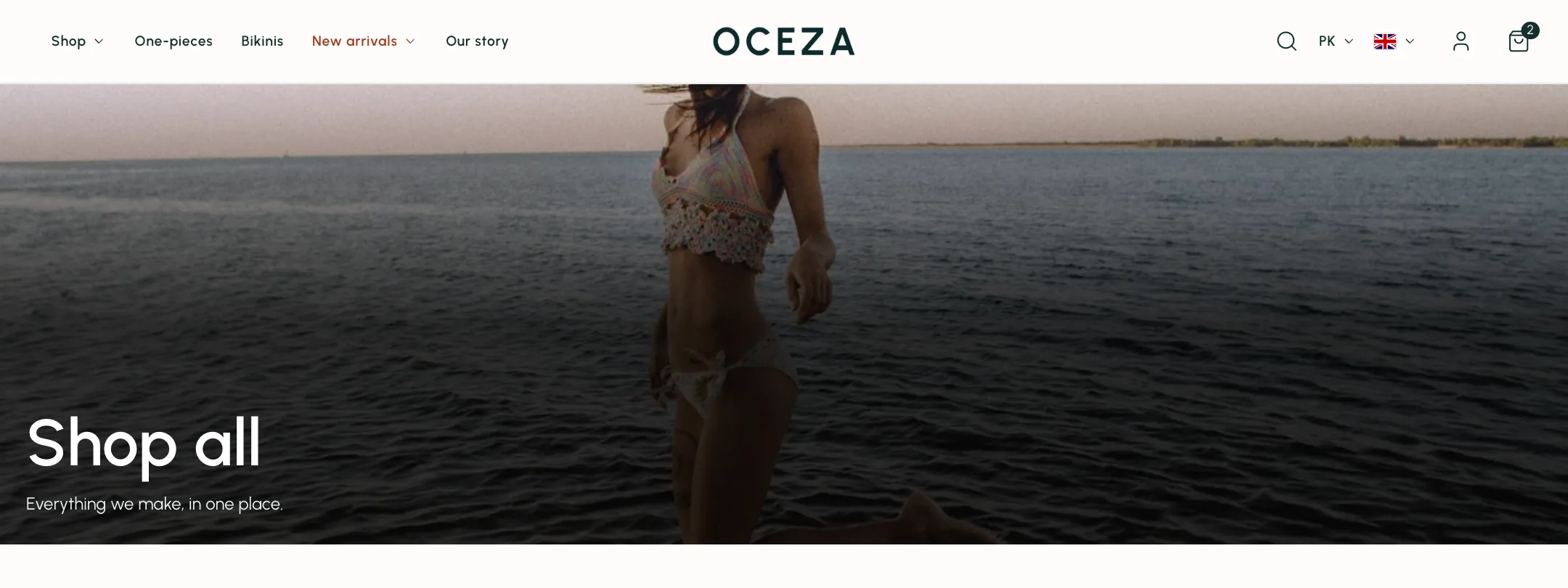
The banner
Section titled “The banner”Under Layout: boxed or full width, a height that adapts to the picture, fills the screen or takes a custom height, and Let the header overlap for a transparent header. Text colors is the scheme for the words.
Under Content: Show collection description, the Content position, its width, and the heading size. Under Image: the overlay and its opacity. The picture itself is the collection’s image from your Shopify admin.
Subcollections
Section titled “Subcollections”Show subcollections lists the collections that belong under this one. Choose them as a shared list under Collections, or connect a collection-list metafield so each collection carries its own. Show them below the banner, or in the banner as buttons under the words.
Layout is Image cards or Links. Cards take a grid or carousel, cards per row, picture shape, the name over or below the picture, a product count, an overlay, and hover zoom. Links take a button style and alignment.
On mobile
Section titled “On mobile”Under Mobile layout: the banner’s own height and heading size, cards as a carousel or a two-column grid, and links in one swiping row or wrapped.