
Cart drawer
When a shopper adds a product, the cart slides in over the page. They can change quantities, remove things, add a note or a discount code, see suggestions, and go to checkout, all without leaving the page they were on.
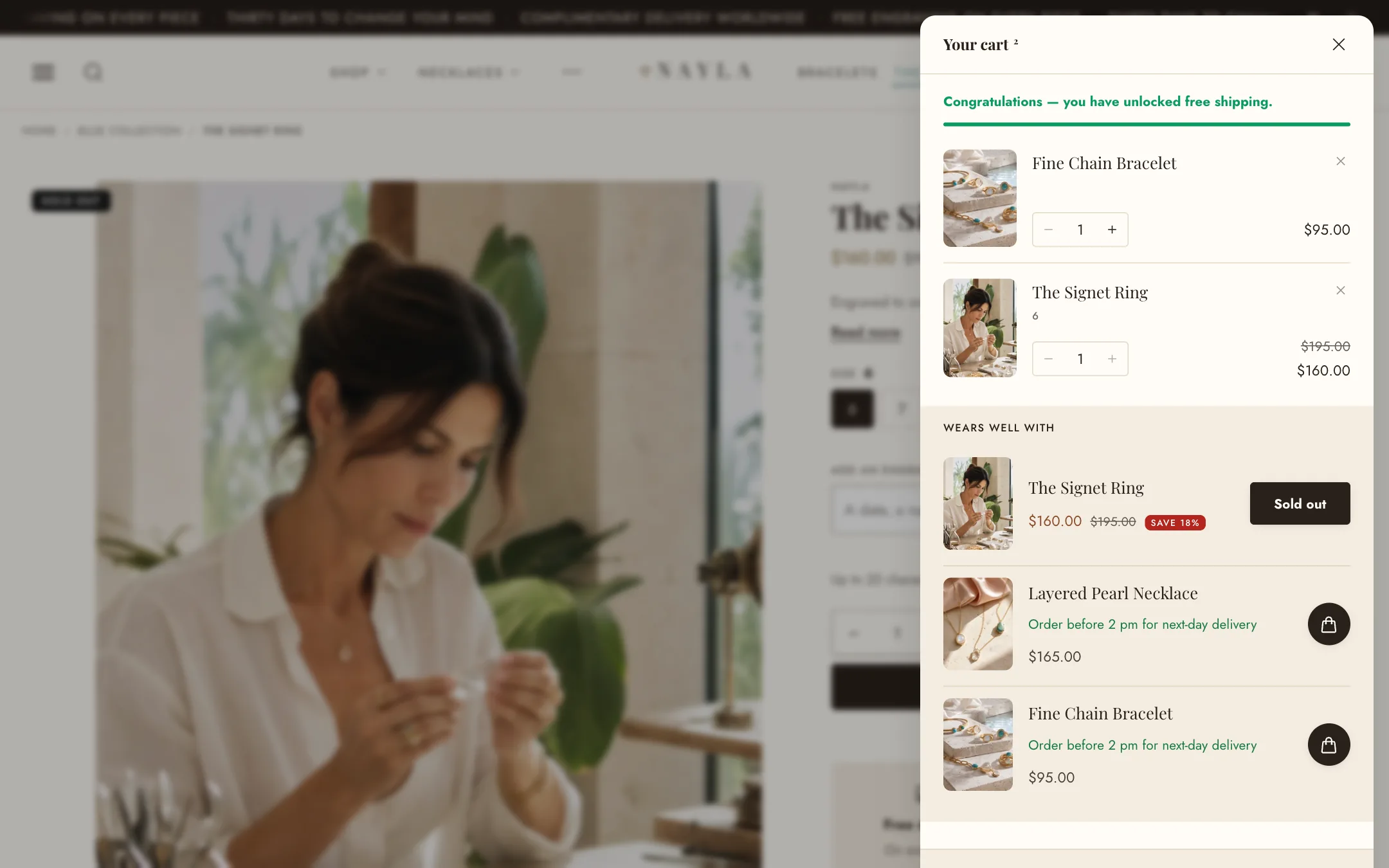
Where the settings live
Section titled “Where the settings live”The cart is set up in two places, on purpose.
- Theme settings → Cart holds everything the drawer and the cart page share: whether the cart opens as a drawer or a page, which actions shoppers get, how product pictures look, and the free shipping goal. Set these once.
- The Cart drawer section, found under Sections in the editor’s left column (it is not on any one page), holds what belongs to the drawer alone: its shape, its colours, its buttons, and its suggestions.
Type and actions
Section titled “Type and actions”Under Theme settings → Cart:
- Type is Drawer or Page. Page sends the shopper to
/cartwhen they add something instead of opening the drawer. - Allow note to seller and Allow discounts in cart switch those features on for both the drawer and the page. Each also has a placement switch in the section, so you can allow a note but only offer it on the page, for instance.
- Allow calculate shipping rate adds an estimator where the shopper enters their country and postcode.
- Installments shows Shop Pay Installments where your store is eligible. Accelerated checkout buttons adds Shop Pay, PayPal and the rest beside Checkout.
How it looks
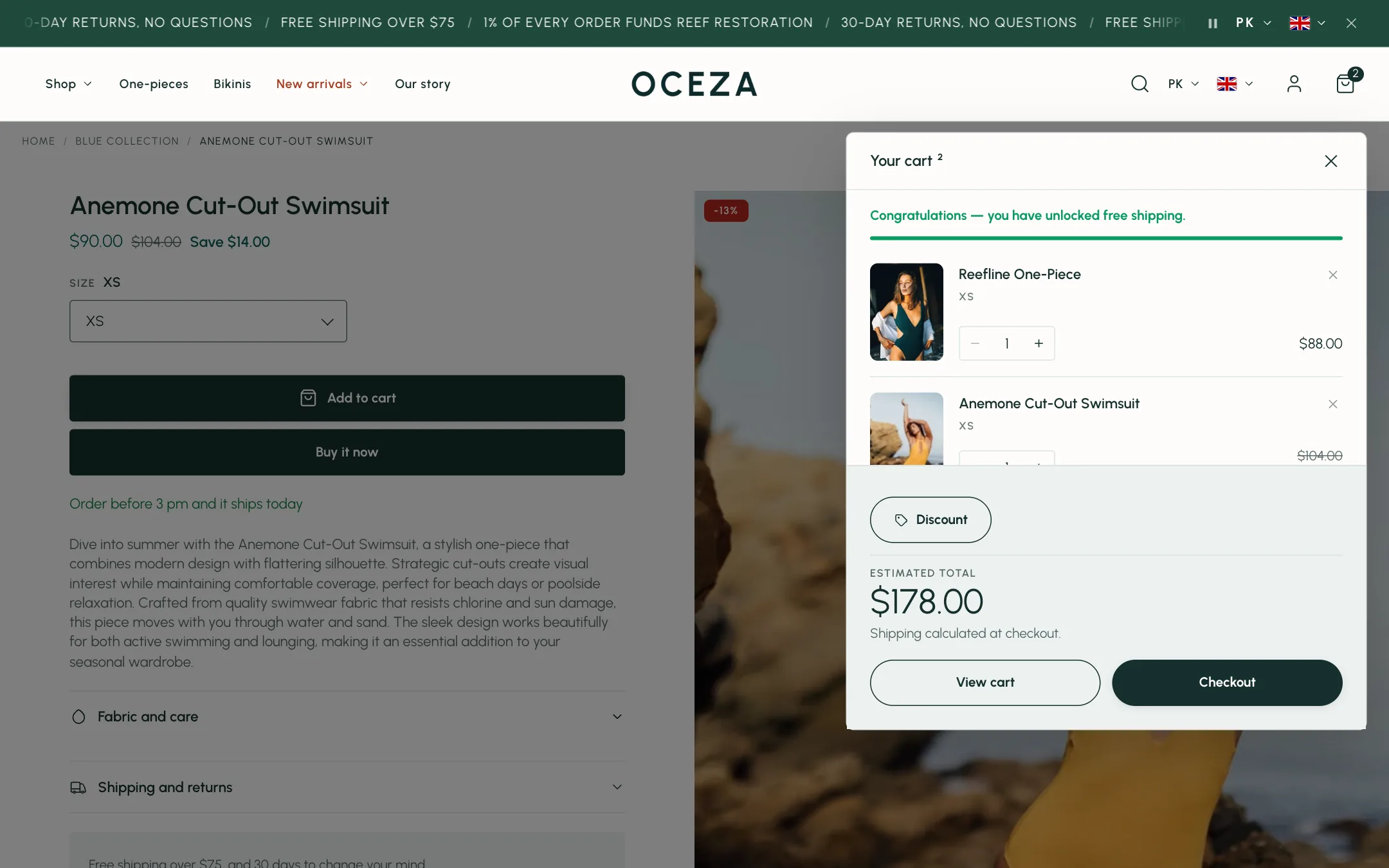
Section titled “How it looks”In the Cart drawer section, under Drawer:
- Layout is Off-canvas cart (a floating panel with rounded corners, set apart from the screen edge), Slide cart (a panel flush with the edge), or Dropdown.
- Distance from screen edge and Corner radius shape the off-canvas panel.
- Opens from is right or left. Width is for large screens; phones always use the full width.
- Page behind dims the page, dims and blurs it, or leaves it alone. Dim amount is how dark.
Under Cart summary, Color scheme paints the drawer and Summary color scheme paints the footer with the total and Checkout. Leave them the same for one continuous surface, or give the footer a dark scheme to set it apart. Show shipping countdown adds the order-by countdown from Theme settings → Shipping and delivery.
The items
Section titled “The items”Each line shows the product picture, name, options, quantity and price. Theme settings → Cart → Media sets the picture’s shape and corners and the style of the quantity control.
When a shopper changes a quantity, the amounts that are about to change dim while the cart works and settle into place with the new figures. Removing an item collapses it out of the list, and a small Undo appears above the items for a moment in case it was a slip.
A product on sale shows its original price crossed out beside the current one. Cart discounts show under the line they apply to.
Buttons
Section titled “Buttons”Under Checkout buttons, Show the View cart button decides whether a second button sends shoppers to the cart page. Both buttons take a style (fill, outline or link) and the Checkout button a corner shape.
Under Discount and note buttons, Note and discount controls picks how the shopper opens the note, discount and shipping panels: small Text links, Labelled buttons (chips with the word on them), or Full-width rows. The buttons take the theme’s button styles. Show the order note and Show the discount code field place those controls in the drawer; each also needs its switch in Theme settings → Cart.
Free shipping goal
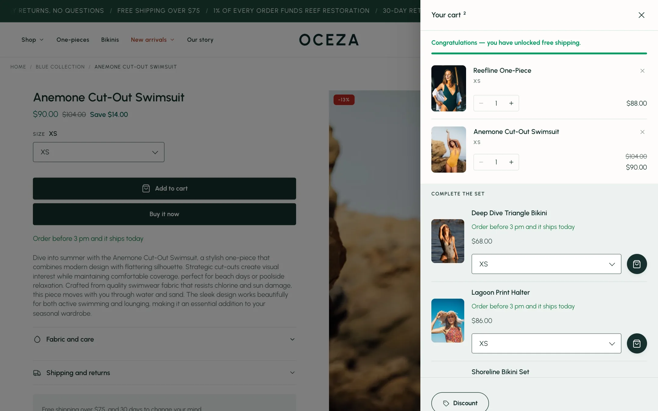
Section titled “Free shipping goal”The bar at the top of the drawer tells the shopper how far they are from free shipping and celebrates when they reach it. Set it under Theme settings → Cart → Free shipping goal: the amount (one per currency if you sell in several, written as USD:100, EUR:95), the progress message with [amount] where the remaining total goes, and the message once it is unlocked. Style is a progress bar or the message alone.
Suggestions
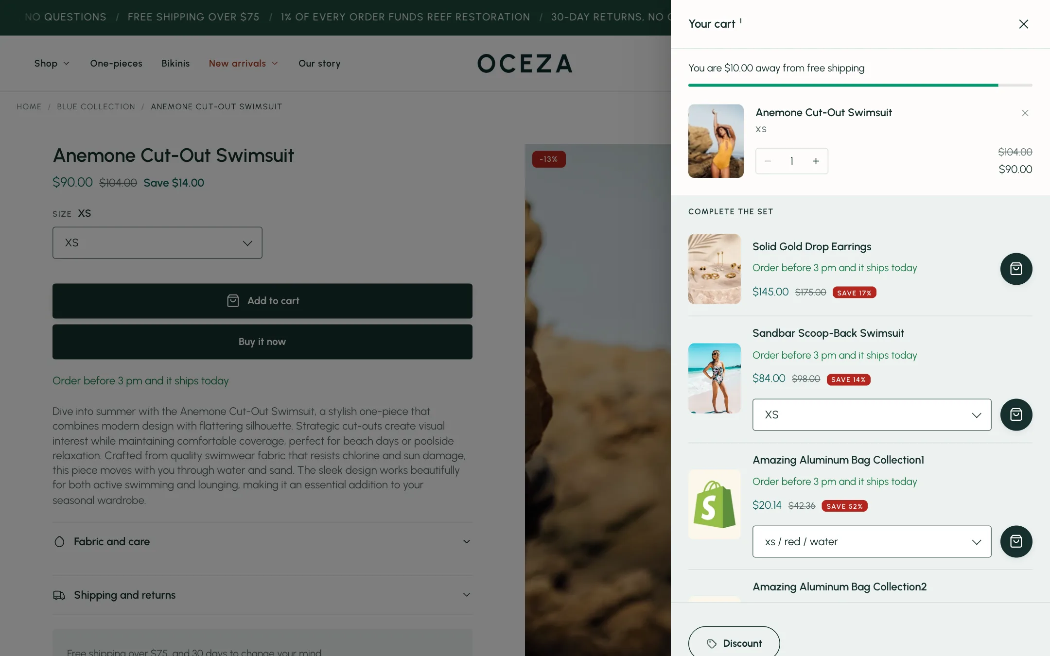
Section titled “Suggestions”Under Recommendations, the drawer lists products that go with what is in the cart. Show complementary products and Show related products use the suggestions Shopify makes; set those up in the Shopify Search & Discovery app. Both kinds are merged into one list under one Heading, capped at Products to show. Backup collection fills the list when Shopify has no suggestion for an item.
Each suggestion is a compact row: name, stock or delivery line, price with any sale badge, and an add button. For products that come in sizes or colours, Theme settings → Cart → Let shoppers pick a size or colour adds a chooser beside the button so they can add the right one without leaving the cart. Show delivery time on suggested products adds the delivery line, worded under Theme settings → Shipping and delivery.
Color scheme under Recommendations paints the suggestions block. On mobile, Title lines under Mobile layout shortens long names so rows stay tidy.
When the cart is empty
Section titled “When the cart is empty”Under Empty cart, the drawer can show a Continue shopping button on its own, or a short line of collections to try. Choose the Collections, the text above them, and how the cards look. Empty-state link is where the button goes; leave it empty for all products.