
Header blocks
The header’s menu comes from Navigation in your Shopify admin. On its own, every top-level item with sub-items gets a simple dropdown. The blocks below change what one item does: turn it into a full-width mega menu, fill that menu with pictures, add promo banners or a panel of collections, or make the item stand out.
Every block that targets a menu item has a Menu item setting. Enter the title exactly as it appears in the menu, including capitalization. The block applies to the first item with that title. You can add blocks for several menu items. A single mega menu can use either column backgrounds or promo banners, but not both.
Mega menu
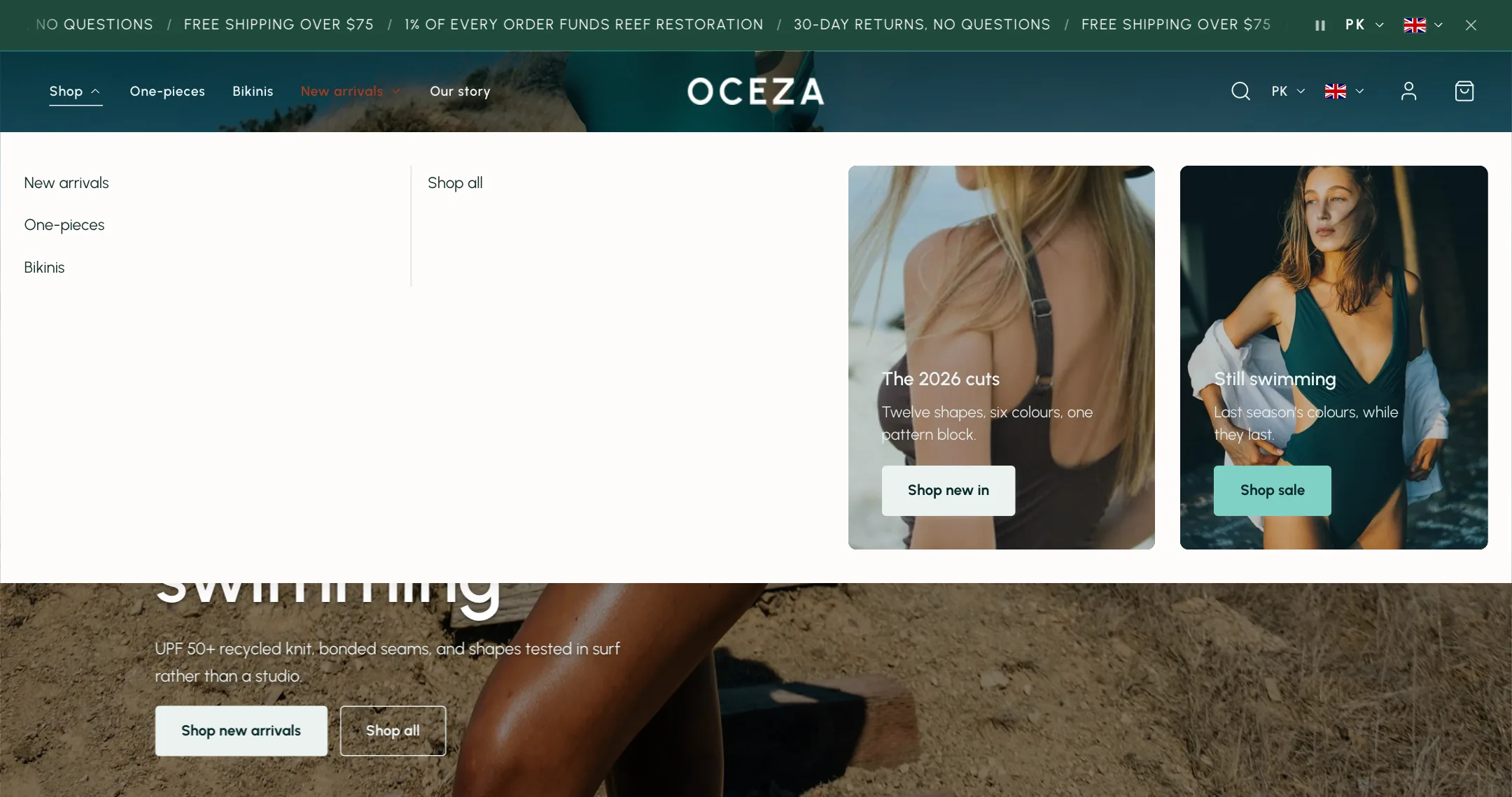
Section titled “Mega menu”A Mega menu block turns a menu item’s dropdown into a full-width panel. Its sub-items become columns, with any nested links listed beneath each heading.
- Menu item: the top-level item, for example Shop.
- Custom items per column: off balances the columns automatically. On, Menu items per column groups links that have no sub-menu of their own this many per column, and Sub-items per column caps how many links show under a sub-section before a View all link.
- Show column dividers: thin lines between columns.
- Mega menu width: Contained sits under the menu item at the page width; Full spans the whole screen.
The Show collection images in menus and Show collection images in submenus switches in the header’s own Menu group put each collection’s picture before its name inside the mega menu too.
Menu column backgrounds
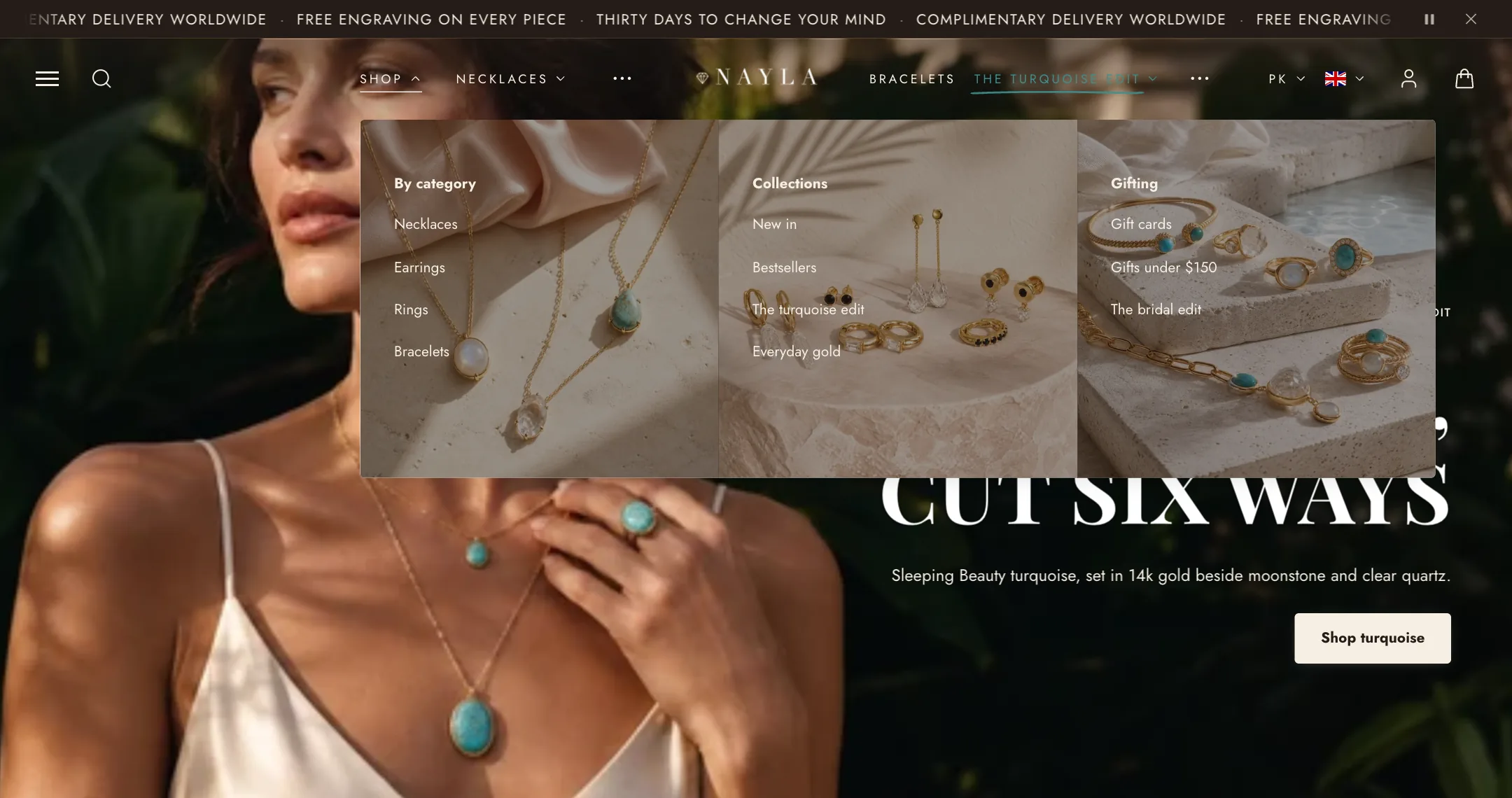
Section titled “Menu column backgrounds”Fills the mega menu’s columns with pictures, left to right: Image 1 fills the first column, Image 2 the second, and so on, up to six. The column’s links sit over the picture.
- Overlay color and Overlay opacity tint the pictures so the links stay readable.
- Text and button colors: a colour scheme for the words over the pictures. Pick one with light text for dark pictures.
- Set each picture’s focal point in the Shopify admin so the right part stays in view when the column is narrow.
Use this or promo banners on one item, not both.
Mega menu promo banners
Section titled “Mega menu promo banners”Adds up to three picture banners inside a mega menu, beside the columns of links.
- Menu item: the item the banners belong to.
- Banner height: landscape, square, portrait, adapt to the first picture, or a custom height. Fill image/video crops to fill; off fits the whole picture inside.
- Zoom image on hover, and Show content below the image (off places the words over the picture).
- Two-banner layout: side by side or stacked, when two are on.
- Banner 1, Banner 2, Banner 3: each has its own switch, Image or silent looping Video, overlay colour and opacity, Text and button colors, content position, heading, description, a button with a label, link, style and new-tab switch, and a Banner link that makes the whole banner clickable.
Under Mobile layout, the banners sit at the bottom of the phone menu panel, in rows or as a swipe, with their own height, and each can take a phone picture, video and content position.
Menu promo collections
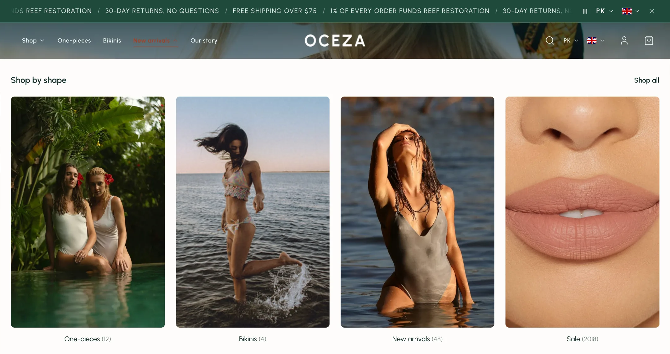
Section titled “Menu promo collections”Replaces an item’s dropdown with a panel of collection cards, and adds a dropdown to an item that has none. Good for a Shop item that should show categories as pictures rather than a list.
- Menu item and Collections: the item and the collections to show.
- Layout: a slideshow or a grid, with Collections per row.
- Image ratio: portrait, square, landscape, circle, or adapt to the first picture.
- Show product count, Show collection titles, title alignment, Title position below or over the picture, and Title visibility always or on hover (touch screens always show them).
- Heading, Link label and Link for a line above the cards and a link to see everything.
- Under Mobile layout: a slideshow or a two-per-row grid inside the phone menu.
Featured menu item
Section titled “Featured menu item”Makes one top-level item stand out. Use it for Sale or New in.
- Menu item: the item to feature.
- Style: Accent color paints the word; Pill puts it in a rounded fill, soft or solid (Pill fill); Marker underline draws a hand-drawn line under it; Sparkles adds small stars.
- Color and Text color: leave empty to use the scheme’s accent and background colours.
Overlay menu
Section titled “Overlay menu”Adds a hamburger button that opens a full-screen menu, for stores that want the header nearly empty or a second, larger menu.
- Menu: what the overlay shows. On mobile the same menu sits behind a View catalog item.
- Menu items size and Submenu items size: small, medium or large. Overlay menu weight: regular or bold.
- Show social links: the links from Theme settings → Social media.
- Overlay image: fills the right half of the overlay on a computer. Portrait, around 1200 by 1600, cropped to fill.
- Under Mobile layout, Add “View catalog” item puts a link in the phone menu that opens this menu.
Where each shows on a phone
Section titled “Where each shows on a phone”Mega menus, column backgrounds and promo collections are desktop layouts; on a phone the same items open as the slide-in menu, with sub-items as panels or expanded in place, chosen under the header’s Mobile layout. Promo banners follow the shopper into the phone menu, at the bottom of the panel. The featured item keeps its style everywhere.