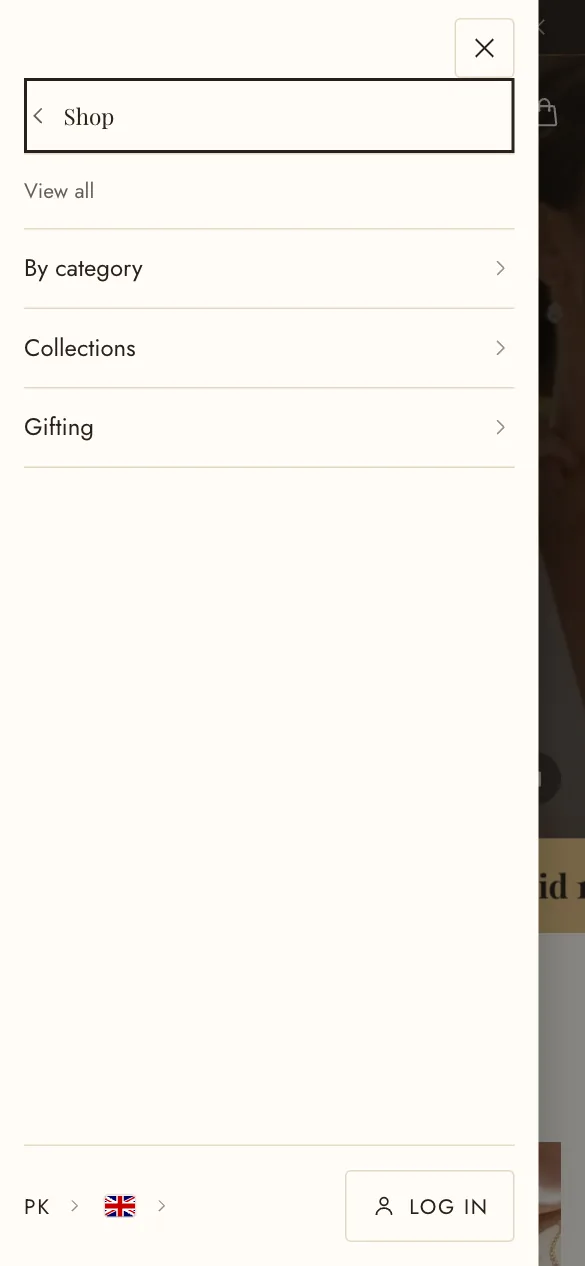
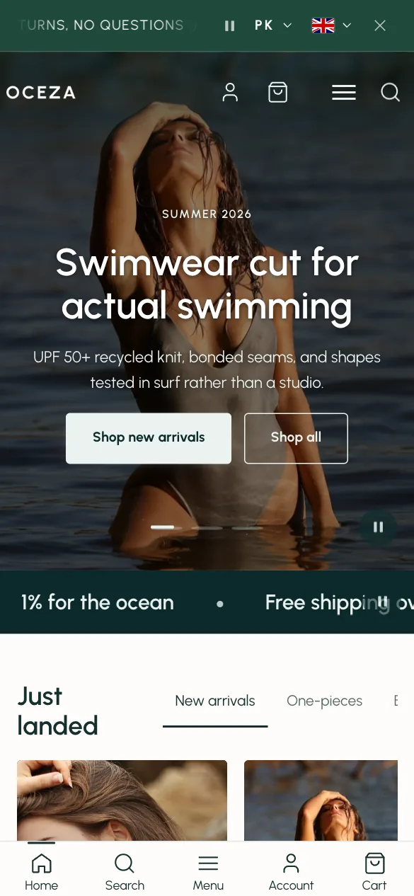
Header and navigation
The header is one section that appears on every page. Select it at the top of the editor’s left column. Its settings run from the overall layout down to the phone menu, and its blocks turn ordinary menu items into mega menus, promo panels and featured items.
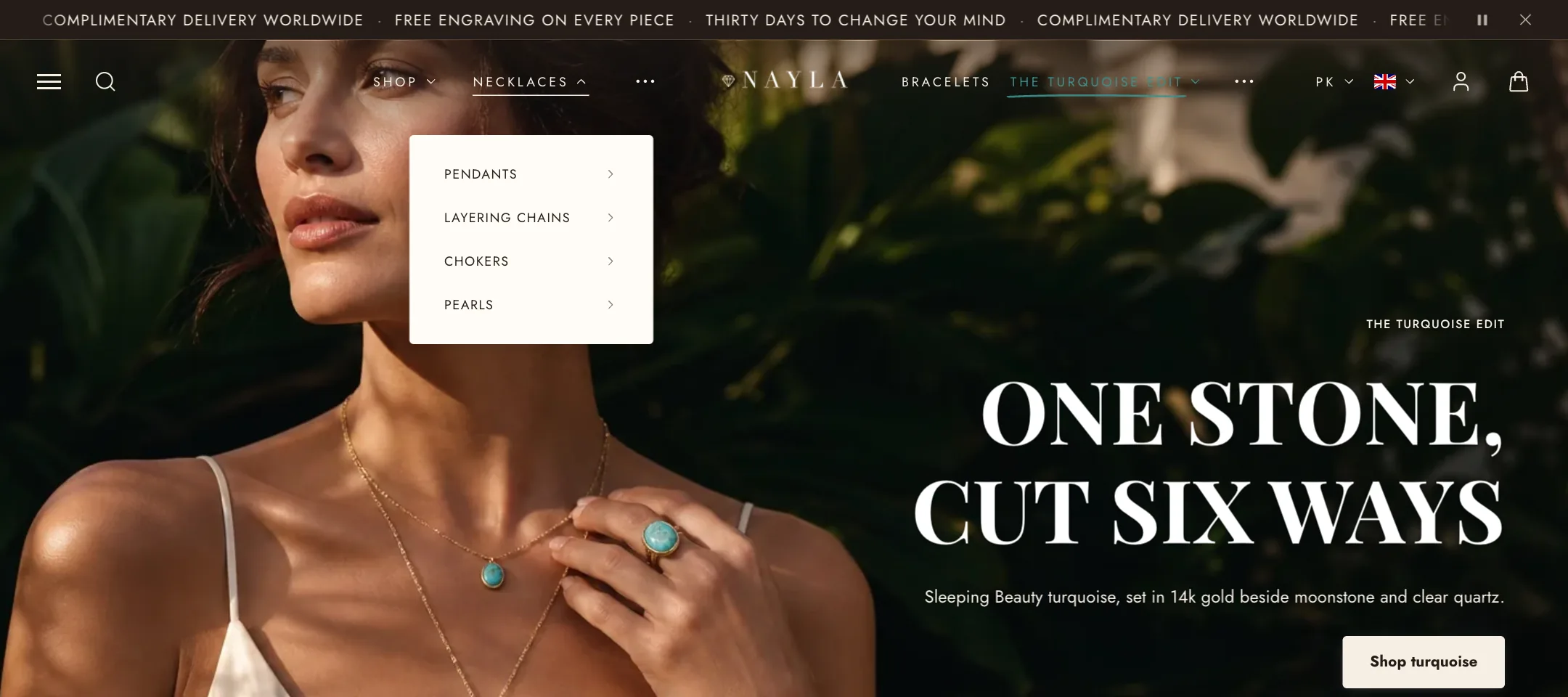
Layout
Section titled “Layout”Header layout offers five arrangements.
- Split menus puts the logo in the middle with a menu each side. Choose the left one under Menu and the right one under Right menu, and keep them about the same length so the logo stays centred.
- Menu/logo/icons and Logo/menu/icons run everything in one row, in that order.
- Classic menu bar puts the logo and icons on one row and the menu on its own row beneath. Menu row alignment sets whether that row starts at the left or is centred.
- Logo on top stacks the logo above the menu.
Header width is boxed to the page width or full to the screen edges. Sticky header keeps it in view as the page scrolls; there is a separate switch for phones under Mobile layout.
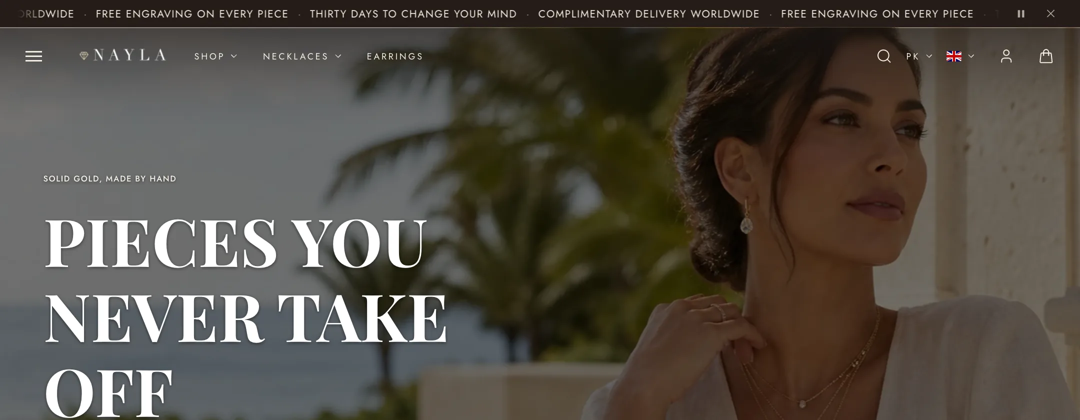
Transparent header
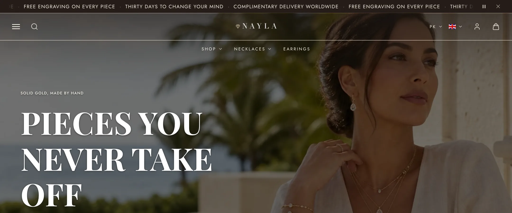
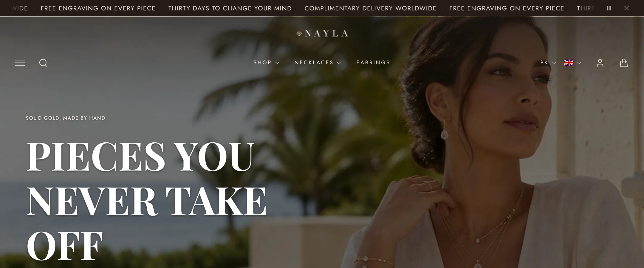
Section titled “Transparent header”A transparent header floats over the first section of the page, which is how most stores open with a full-screen picture. It takes two steps: set Transparent header here to Transparent or Solid on hover, then turn on Let the header overlap in the banner section itself. The header then takes its colours from that section, so white text over a dark video needs nothing more.
Light logo is a second logo for the transparent state, for when your usual one is dark. Text color can be left on Auto or set to a custom colour. If the picture behind is busy, Contrast fade strength tints the strip behind the header so the menu stays readable.
The menu
Section titled “The menu”Under Menu, choose the menu from Navigation in your Shopify admin. The type settings (font, weight, size, letter spacing, case, spacing between items) shape the menu row. Underline menu items on hover draws an animated line under the item the shopper points at and under the current page.
Show collection images in menus puts each collection’s picture before its name in dropdowns; Auto-fill collection images uses the first product’s photo when a collection has none.
A menu longer than the space it has either collapses into a More dropdown or scrolls sideways, chosen under When the menu is too long.
Mega menus and promo panels
Section titled “Mega menus and promo panels”These are blocks. Add one and name the menu item it belongs to, spelled exactly as it appears in the menu. Each block’s settings are described on Header blocks.
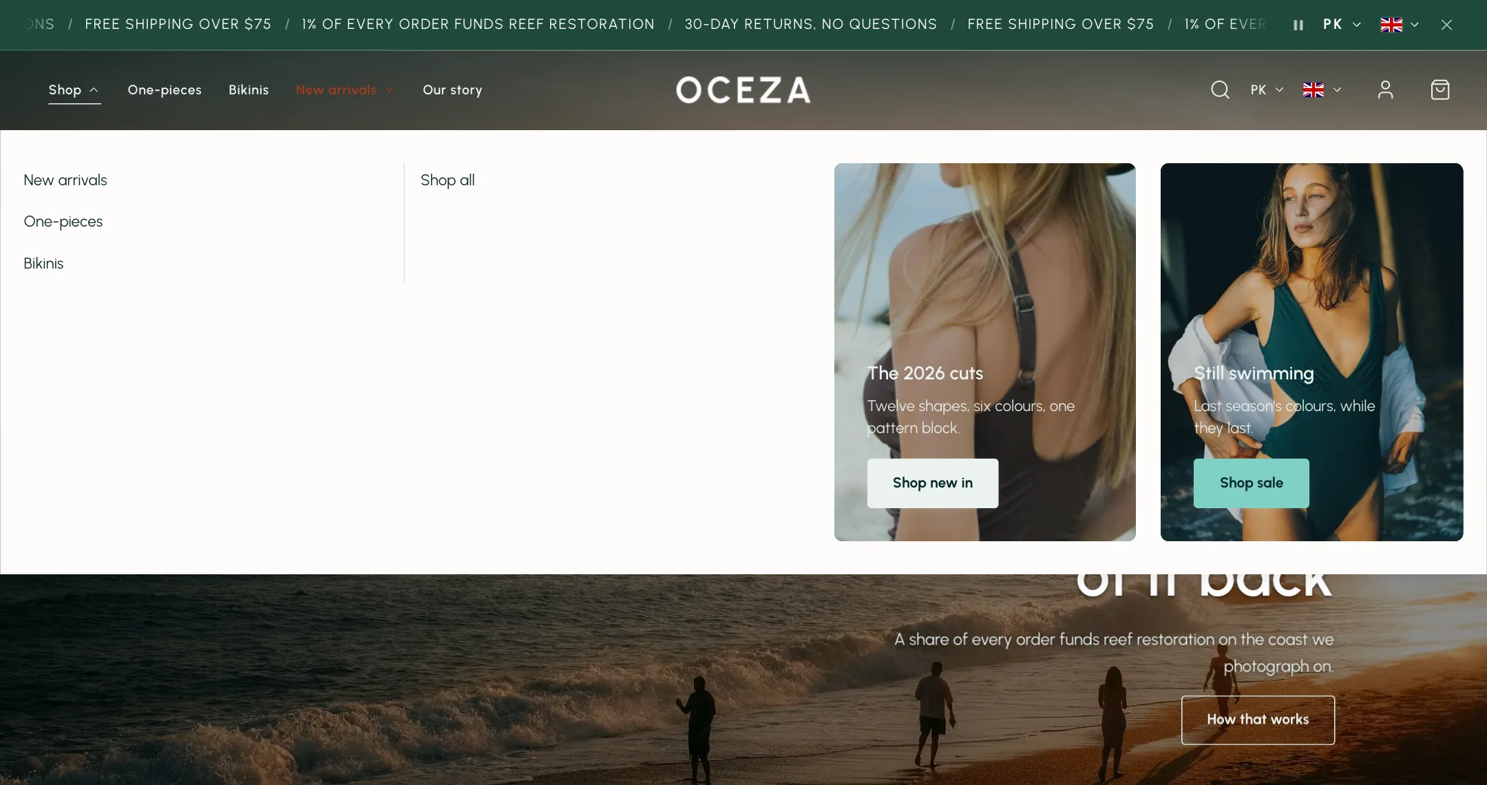
- Mega menu turns that item’s dropdown into a full-width panel with its sub-menus as columns. Columns balance themselves unless you set the counts. Mega menu width is contained under the item or the full screen.
- Mega menu promo banners adds up to three picture banners, with a video option, to a mega menu. Each has its own heading, text, button and colours.
- Menu column backgrounds fills the mega menu’s columns with pictures instead.
- Menu promo collections replaces an item’s dropdown with a panel of collection cards, as a grid or a slideshow.
- Featured menu item makes one item stand out: an accent colour, a pill, a marker underline or sparkles. Use it for Sale.
- Overlay menu adds a hamburger that opens a full-screen menu with a large picture beside it, for stores that want the header nearly empty.
Search, account and countries
Section titled “Search, account and countries”Show search and Show account add the corresponding header icons. When signed out, the account button uses the icon you select. When signed in, it shows the customer’s initial or Shop profile image and opens the Customer account menu. Sign-in, orders, addresses, and profiles are managed by Shopify; enable customer accounts under Settings → Customer accounts. The theme does not need separate account pages. Show country/language selector adds market selectors when your store supports more than one country or language, with options to display codes, names, or flags.
On mobile
Section titled “On mobile”Under Mobile layout, the phone header has its own choices: logo centred or on the left, a separate Mobile menu if you want a shorter one, its own type settings, and whether the menu slides in from the left or up from the bottom. Submenus open either as panels the shopper drills into or expanded in place.
Extra mobile links adds a small list under the menu, such as FAQ and Contact. Featured product puts one product as a card at the end of the menu. Mobile search is a compact icon that opens a drawer, or a bar that always sits under the header.
Show bottom bar pins a row of icons to the bottom of the phone screen: home, search, menu, account, cart, and up to two links of your own with their own icons. On scroll keeps it always visible or hides it while the shopper scrolls down, and Appear only after scrolling keeps it out of the way until they have moved past the first screen.