
Cart page
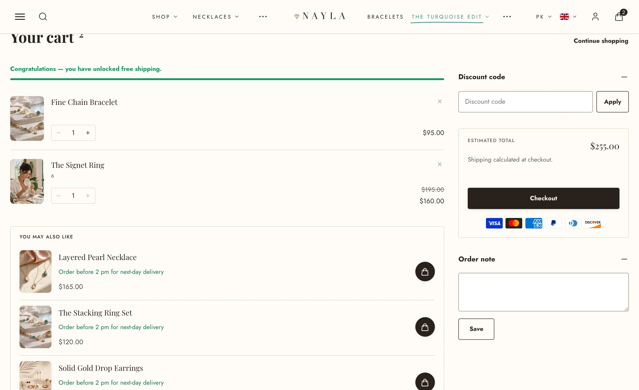
The cart page is where shoppers land when they choose View cart, or when Type under Theme settings → Cart is set to Page. It shows the same items, prices and suggestions as the cart drawer, with room for more: a sidebar built from blocks, so you decide what sits beside the total.
The page
Section titled “The page”Open it in the editor by switching to the Cart page. The section’s own settings:
- Width is boxed or full width.
- Heading size sets the size of the “Your cart” heading.
- Continue shopping link is where the link under the heading goes. Empty means all products.
- Show the free shipping goal puts the same progress bar the drawer uses above the items. The goal itself is set under Theme settings → Cart.
Everything the page shares with the drawer lives under Theme settings → Cart: which actions are allowed, how product pictures and the quantity control look, and the free shipping goal. Changing a quantity or removing an item updates the totals in place without reloading the page, with the same dim-and-settle motion and the same Undo as the drawer.
The sidebar
Section titled “The sidebar”The sidebar is made of blocks. Add, remove and reorder them like blocks anywhere else in the theme. The order you set is the order shoppers see, on every screen size.
- Total and checkout is the one block you cannot do without. It shows the estimated total, the tax note, how much the shopper saves (Show how much the shopper saves), and the Checkout button in the style and corners you choose. Show payment methods under Checkout lists the payment icons your checkout accepts. Under Terms, turn on Ask shoppers to accept your terms before checkout and write the line, linking your policy in it; the shopper must tick it before Checkout works.
- Discount code is the code field. It can be a plain row or a card with its own colour, open by default or folded away.
- Order note is the message-to-seller field, with the same choices plus a Save button width.
- Shipping countdown shows the order-by countdown from Theme settings → Shipping and delivery.
- Reassurance line is one short line with an icon: free shipping, easy returns, secure checkout. Add as many as you need; they stack.
- Text panel is a folding panel for anything a shopper wants to know before paying, such as delivery times or returns.
- Custom Liquid is for code a developer gives you.
- App blocks appear here too, for apps that add something to the cart.
The discount code and order note blocks only show when their switches are on under Theme settings → Cart.
On a large screen the sidebar stays in view as the shopper scrolls a long list of items.
Suggestions
Section titled “Suggestions”Under Recommendations, the page can list products that go with what is in the cart, in the same compact rows the drawer uses: Complementary products and Related products from Shopify Search & Discovery app, merged into one list under one Heading and capped at Products to show. Color scheme paints the block. Size and colour choosers and the delivery line follow the shared settings under Theme settings → Cart.
When the cart is empty
Section titled “When the cart is empty”Under Empty cart, choose the collections to suggest, the text above them, how the cards look, and the style of the Continue shopping button.
On mobile
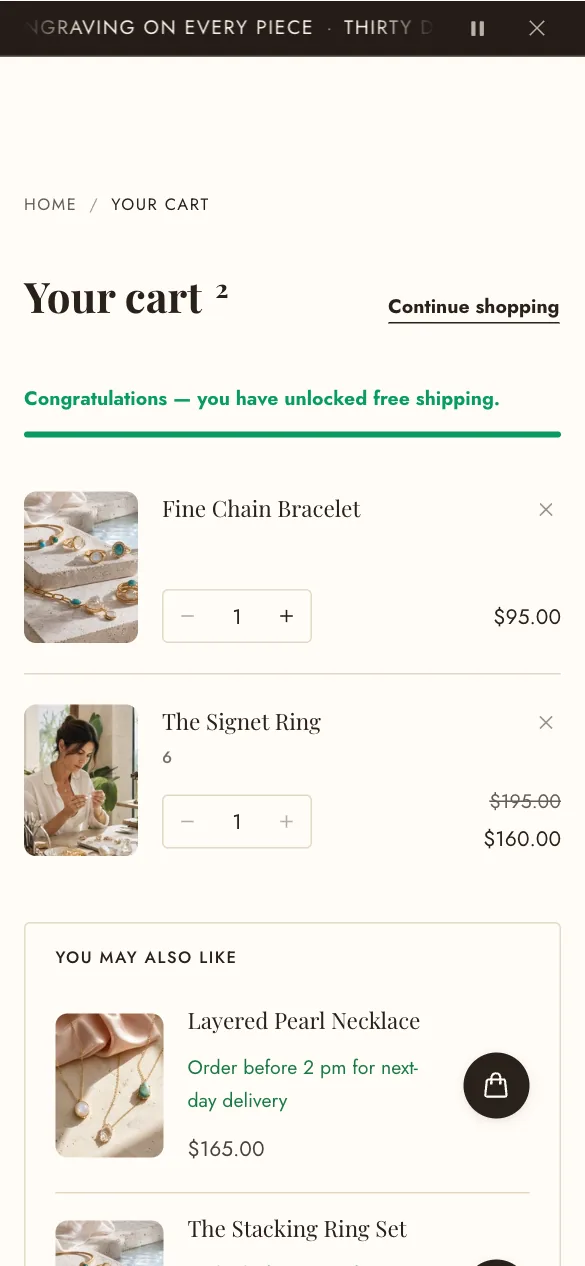
Section titled “On mobile”Under Mobile layout:
- Keep Checkout in view while scrolling pins a slim bar with the total and the Checkout button to the bottom of the screen, so a shopper with a long cart never has to hunt for it.
- Title lines shortens long product names in the suggestions.
The sidebar blocks stack under the items on a phone, in the order you set.
Spacing
Section titled “Spacing”Section spacing works as it does everywhere in the theme: the space below the section is this section’s to set, for desktop and mobile separately.