
Featured collection
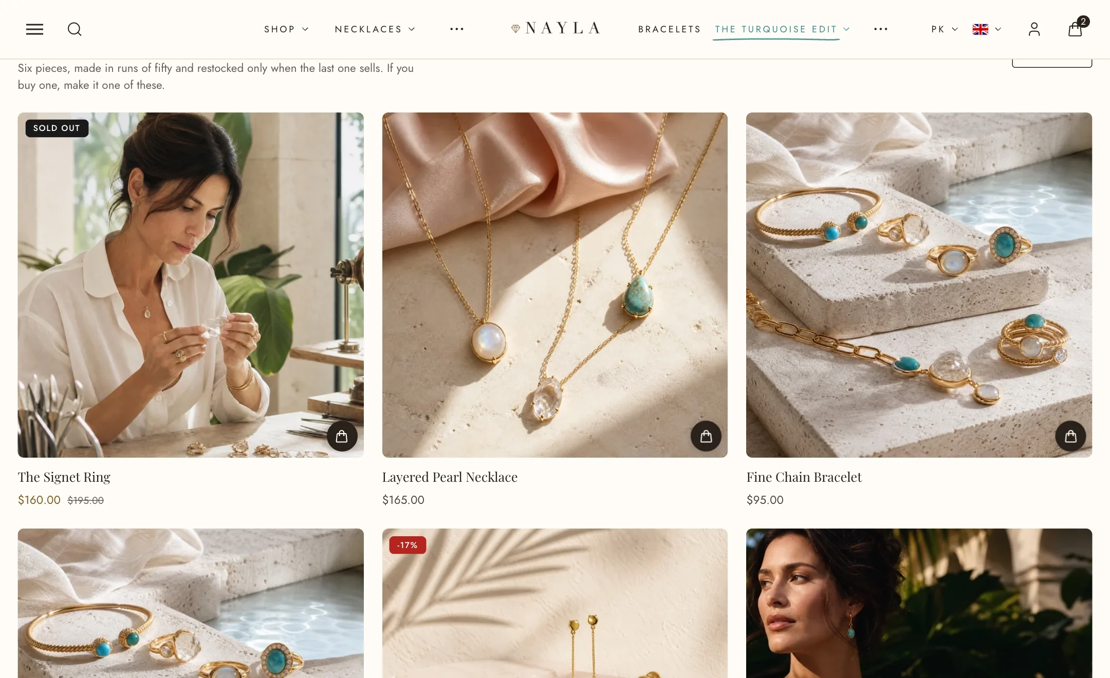
The most used section on a home page: a heading, a row or two of products, and a View all link to the collection.
Set it up
Section titled “Set it up”Pick the Collection and how many Products to show. Under Heading, write the heading and subtext, align them, and switch Show ‘View all’ link on with its label and style.
Under Layout, Grid shows every product at once; Carousel puts them on one row the shopper slides, with a Pagination control (arrows, progress bar, dots, lines or none), the arrows over or below the products, and their alignment. Products per row is two to five. Width is boxed or full.
How each product card looks is set for the whole store under Theme settings → Product cards.
Several collections in one section
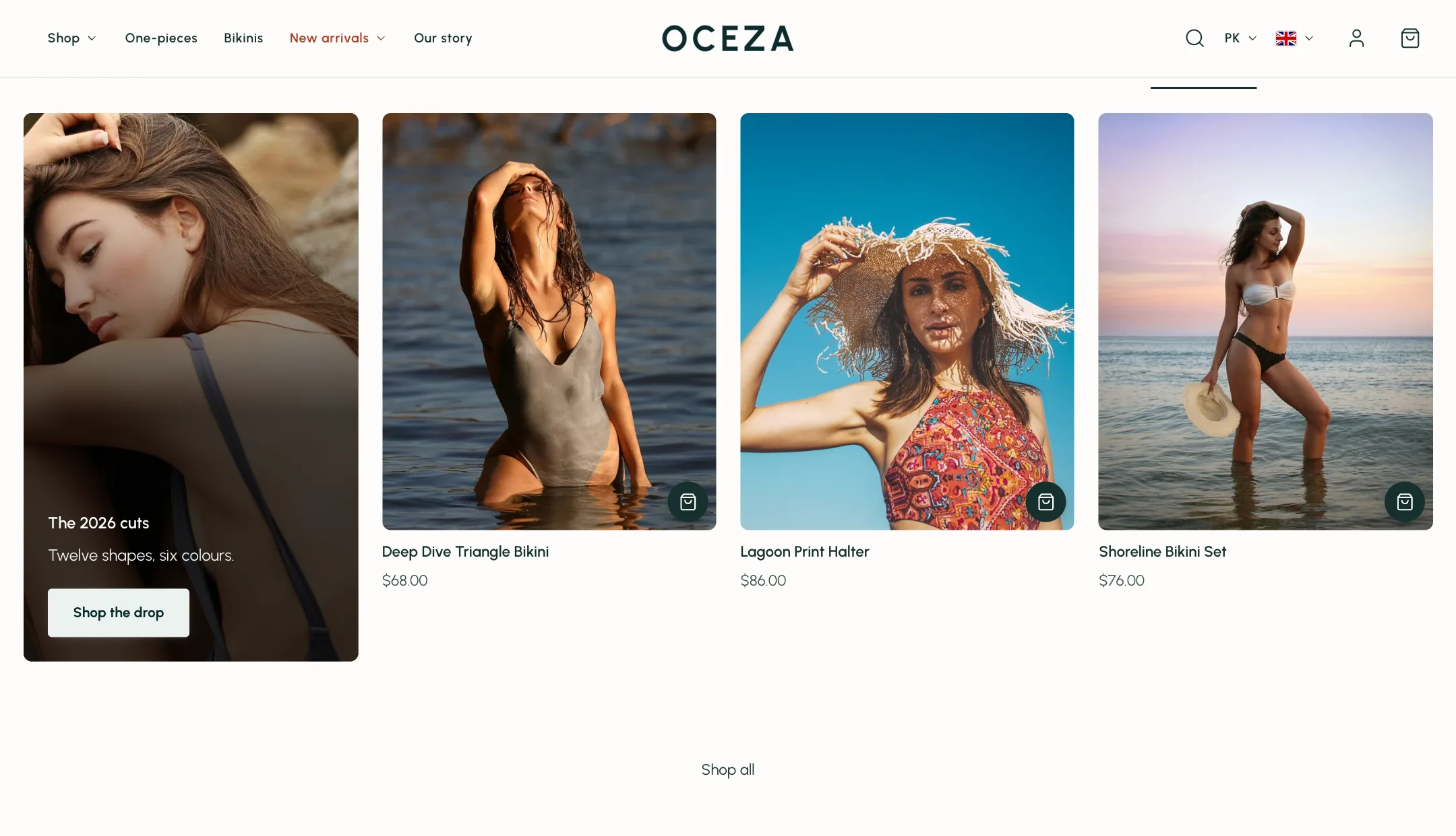
Section titled “Several collections in one section”Add a Collection tab block for each collection and the section grows tabs above the products. Each tab has its own Tab name, or takes the collection’s. The section’s own Collection setting is ignored once tabs exist.
A tab can also carry a promo card: a picture card in the first spot before the products, with a heading, text, a button and a link, coloured by its own scheme with an overlay. Use it for a campaign message inside the grid.
On mobile
Section titled “On mobile”Under Mobile layout: heading alignment, grid or carousel, its own pagination, and one or two products per row.